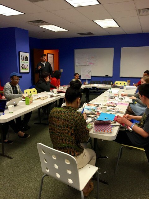
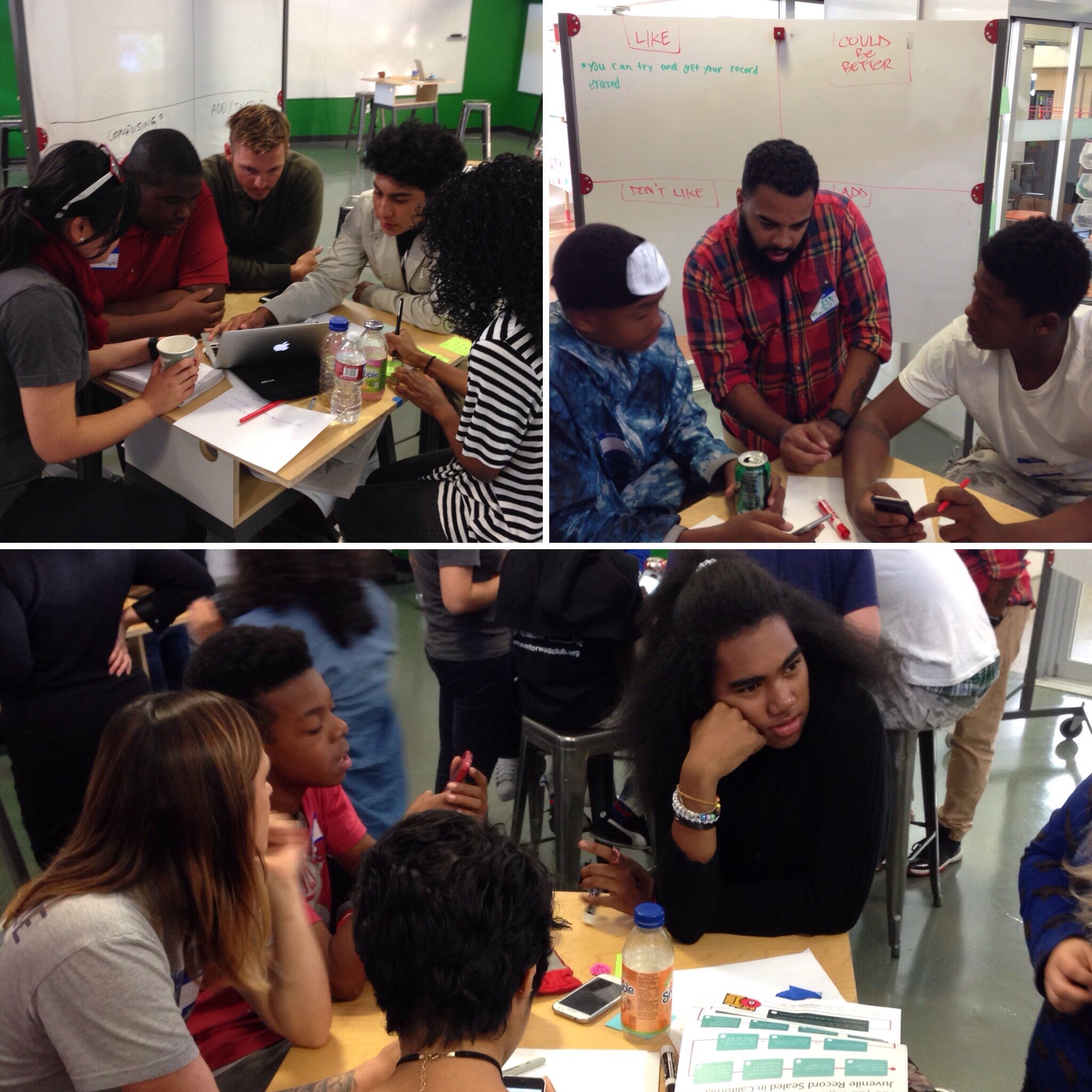
 On Saturday, May 2, I was invited to the Mikva Challenge offices to lead a design session on Expunge.io with the Juvenile Justice Council (JJC). Expunge.io is a website designed for people with juvenile records in Illinois to kick off the process of expunging (or erasing) those records. The idea for Expunge.io came from #CivicSummer when the JJC wanted an app to help people expunge their records. We wanted to hold this design session to improve the website and make sure that Expunge.io has a youth-led voice.
Here were my main goals for this design session:
- Get a better understanding of youth’s favorite websites and why
- Better understanding of what the JJC likes/dislikes about Expunge.io now, and what they would like to see
- How do young people want to contact the Juvenile Expungement Help Desk?
- How do youth want lawyers at the Juvenile Expungement Help Desk to contact you?
Working in a youth-led tech project means stepping back to let youth lead. The most important thing I could have done in this Expunge.io design session was allow the JJC to voice their opinions, listen, and let them identify issues and solutions to make Expunge.io a youth-led website.
Favorite Websites
We started our conversation with talking about favorite websites that the JJC members liked and didn’t like. I wanted to start the conversation around technology and websites before we talked specifically about Expunge.io.
Some favorites included: Spotify, Instagram (the app, not the website), Google, Facebook, PolicyMic, Desmos, and more. When talking about these websites, the youth specifically mentioned design elements and the ease of navigating through the site as the main reasons for liking the site. They want to be able to search and find what they are looking for quickly.
Some websites that JJC members didn’t particularly like included: ESPN, Buzzfeed, Pandora, government websites (especially those directed to teens), corporation websites, and others. The biggest issues the JJC talked about with these sites were difficulty navigating the sites, ads, and language. For example, when talking about Buzzfeed, some youth mentioned that their age group was not the targeted group for a lot of the articles. For other websites, they felt that the website tried to use youth language and it came across as disingenuous.
Expunge.io: “What I love/don’t like/wish…”
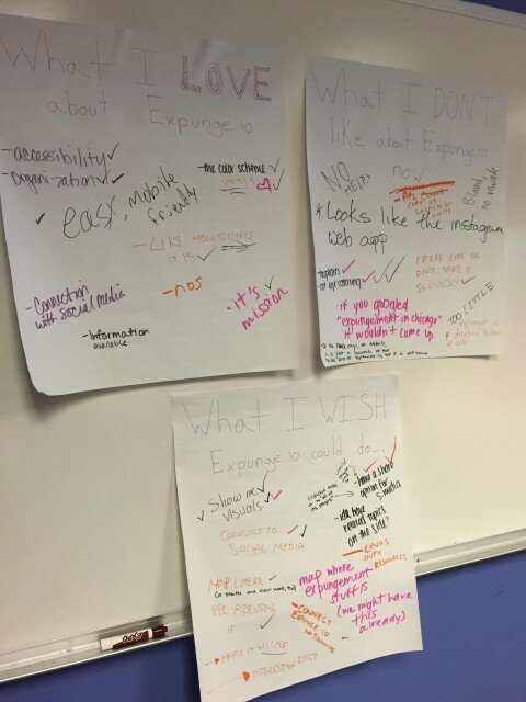
Next, I asked the JJC members to write everything that came to mind when thinking about “What I love about Expunge.io…” “What I don’t like about Expunge.io now…” and “What I wish Expunge.io could do…”
Love:
I heard that the JJC loves the mission and the goal behind Expunge.io. They love that it is easy to use, “simple,” connects with social media, and is mobile friendly. Most of the JJC also liked the color scheme we’re using.
Don’t Like:
There was a consensus that Expunge.io is “too plain,” “not eye catching” and “bland” because it doesn’t have photos or videos. The JJC members also wanted to see more testimonials from people that went through the expungement process, and share facts about why expungement is important.
In addition, we discussed how the FAQs page could be better organized so that it isn’t “too much text,” and how we can improve SEO to make sure that if you googled “expungement in Chicago,” Expunge.io would show earlier in the results.
Wishes:
Here is the wish list the JJC came up with:
- More visuals
- More connections to social media, not just on the homepage but every page
- Map of where others redeployed Expunge.io in other cities
- Links to resources
- Map of where expungement “stuff” is (like the Cook County Juvenile Center, the Help Desk, etc)
- More expungement-related facts
I was surprised by this list because every point is something that we can work towards including on Expunge.io. There was not a single suggestion that was out of reach. This activity worked well because it not only got the youth moving, but allowed them to contribute their ideas anonymously. It also allowed the conversation to be driven by the youth’s ideas and not my own.
The Voice behind Expunge.io
For another activity, I had a stack of magazines and art supplies and I asked the youth to create a collage of “the voice behind Expunge.io.” My question was, “When you look at Expunge.io, who do you imagine is speaking to you? Describe what this person looks like.”
 Here are some the ways the JJC describes the voice behind Expunge.io: “older,” “cold,” “corporate,” “rich,” “unrelatable.” The colors chosen were muted, and very few of the photos chosen had people looking towards the camera. A lot of the photos chosen included older individuals and people wearing suits.
 For the second part of the activity, I asked them to do the same thing but this time my question was, “Who do you want to be speaking to you? Who would you listen to?”
Here are some the ways the JJC wants the voice of Expunge.io to sound like: “friendly,” “younger,” “approachable,” welcoming” “trust.” The JJC chose a lot of motivational phrases like “fresh start” “go forth” and “don’t have to start alone.” The colors used were more vibrant, and the people in the photos were younger, and more inviting.
List of Changes
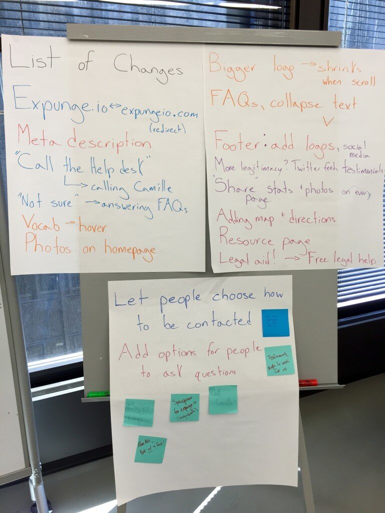
 Early in the day, I added a few pieces of paper on the wall to keep track of all of the changes we decided to make as a group. I told everyone that they could at any point in the day come up and write on the board.
I learned from this experience that it’s very easy to listen to problems on a website, and start making suggestions and creating your own list. I had to step back and let the JJC think about what their solution would be, whether it was a tech or non-tech solution. Once they came up with solutions, we would discuss, and then decide together what should be a change. This is the list of changes the JJC came up with:
- Create a redirect from expungeio.com to Expunge.io since we use “Expunge.io” as a name and it becomes confusing since .io isn’t a typical part of a url
- Update the meta description so that Expunge.io is higher on search results
- When people are “Not Sure” of the answer during the question flow, we need to provide better information to help them along
- Allow users to hover over a word they are unfamiliar with and get the definition
- Share more expungement statistics and photos
- More prominent logo on the homepage. The JJC is proud of the logo and they want to make it more visible
- On the FAQs page, the text should collapse/expand under the question so it does not look like an overwhelming amount of text
- On each footer, the social media share options should be there and logos to create more legitimacy
- Create a resource page and add map and directions
- Change Legal Aid! on navbar to “Free Legal Aid!”
- Let people choose how they want to be contacted. Also, we heard that “Call the Help Desk” has negative connotations of support lines and long waits. We wanted to share that there is a lawyer on the other end of the line so instead of “Call the Help Desk” we will say “Call Camille at the Help Desk!”
I am grateful for the JJC letting me work with them. They were engaged and offered detailed opinions and solutions. I am excited to see these changes implemented in Expunge.io.


