Our CUTGroup Proctor, Nathalie Rayter, wrote the final analysis report for this test. The CUTGroup Proctor Program trains once highly active CUTGroup testers to learn more about usability (UX) testing and CUTGroup test processes.
 For our twenty-fourth Civic User Testing Group (CUTGroup) session, we tested OpenGrid– an open-source interface developed by the City of Chicago that allows residents to search for, interact with and visualize City of Chicago’s datasets.
“OpenGrid has an intuitive user interface that’s highly responsive and efficient. The application is accessible from any devices (e.g., mobile, laptop, tablet or desktop). It’s unique, functional, and an easy to use tool to find city data. It extracts city data and displays it in an illustrative form which makes it easier for a user to search and understand the information.”
– City of Chicago Department of Innovation & Technology (DoIT)
The City of Chicago DoIT conducted some user research and testing of OpenGrid before this CUTGroup test, but it tended to be with high-capacity users or City of Chicago staff. The DoIT department wanted to better understand how residents with different levels of data familiarity and digital skills might use OpenGrid.
“Programmers, however, make up a very small portion of the overall population of a city – as a platform grounded in open data, OpenGrid’s mission is to be accessible by anyone who wishes to learn more about their city…
CUTGroup’s process provides a vital link between developer and user that the civic tech world sometimes lacks. It’s one of the most human crowd-sourced enhancement mechanisms that a civic app developer could have in her toolkit.”
–Sean Thornton, Program Advisor for the Ash Center’s Civic Analytics Network and writer for Data-Smart City Solutions
Segmenting
On April 12, we sent out an email to 1,132 CUTGroup testers who live in Chicago. We wanted to know if they would be available for an in-person test on April 20, 2016. When segmenting our testers, we were interested in including testers who described themselves as not being very familiar with using datasets in their personal or professional lives. We also wanted to include testers who had varying degrees of familiarity with what was happening in their neighborhoods. Lastly, we wanted to include testers with different types of devices.
Screening Questions
During our initial call-out for testers, we heard from 98 CUTGroup members. We received a lot of good information just from the screening questions.
- 38% of respondents used the Chicago Data Portal before
- 38% of respondents use or work with datasets in their professional lives, but only half of these respondents said they used the data portal in the past
We were looking to include 20-25 testers for this test. We wanted to test with half of them on laptops and the rest on a variety of mobile devices.
Test Format
For this in-person test, each tester was paired up with a proctor who at this time was either a City of Chicago DoIT employee or involved with the project (this test happened before we formalized a proctor program). Proctors guided testers through doing multiple tasks on OpenGrid, observed the results, and took notes on the testers’ experiences and feedback. This test also utilized A/B testing, where 13 of the testers (“A” Testers) began on http://opengrid.io/ (OpenGrid’s homepage) and the other 10 testers (“B” Testers) on http://chicago.opengrid.io/opengrid/ (the app interface). We also wanted testers to test either on laptops that we provided or their own mobile device.

“A” testers reviewed this homepage.
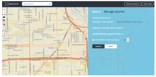
“B” testers began directly within the OpenGrid app
Results
On April 20, we tested OpenGrid with 23 CUTGroup testers at the Chicago Public Library Legler Branch located in the West Garfield Park neighborhood.
This presentation was shared with the City of Chicago DoIT team that highlighted top results from the test.
Homepage
Through the A/B format of this test, we learned how important the context from the OpenGrid homepage is. Testers who started directly in the app were typically more confused about next steps or misunderstood what OpenGrid does. We did hear, though, that there is a lot of information on the OpenGrid homepage, and parts of the homepage spoke to different audiences (especially technical audiences), which made testers feel that this website was not necessarily targeted to them.
“I wouldn’t understand this unless I was in technology. ‘Open source’ is definitely for the ‘tech folks’ and does not matter to me.” -Yoonie, #A18
7 out of the 13 “A” testers who started on the OpenGrid homepage said this website was targeted to Chicago residents, whereas, there was much less consensus about who the target audience is among testers in Group B.
Testers who started on the OpenGrid homepage typically clicked “Launch” (7 out of 13 testers clicked on this button) as their first step. “B” testers did not have a clear sense of what to do first, and therefore, did more exploratory actions to learn more about what OpenGrid does.
Ease of use
As the test designer, I was not prepared for how difficult some of the tasks would be to complete on both mobile and laptop devices. Test sessions typically lasted over an hour, and the majority of testers said that the tasks were “difficult” or “very difficult” to complete. We were lucky to get great, actionable feedback from our CUTGroup testers, which I translated to open GitHub issues on the City of Chicago’s repository.
Overall, how easy do you think it is to use the OpenGrid website?
Group A
5 – Very easy 0%
4 – Easy 23% (3)
3 – Neutral 23% (3)
2 – Difficult 31% (4)
1 – Very difficult 23% (3)Group B
5 – Very easy 0%
4 – Easy 20% (2)
3 – Neutral 40% (4)
2 – Difficult 10% (1)
1 – Very difficult 30% (3)
We heard a number of improvements that the OpenGrid team could make to improve searching for, finding, and filtering datasets. 13 testers recommended that changes should be made to the OpenGrid search tools to make it easier for users to find the information they are looking for. 7 of these testers thought that the search bar should respond to addresses/zip codes or tags like “311.” 3 testers commented that the existing search filters are too complicated and that they should be simplified. Paloma (#B8) says, “Commonly used queries was easy; all other filters made it difficult.”
7 testers mentioned that they would improve the descriptions and instructions that orient the user to the OpenGrid interface. 2 of these testers recommended adding instructions that suggest how a user would interact with the page, such as suggesting a search or having sample questions. For example, Cleveland54 (#B3) says, “The advanced search panel should be pushed down with a note at top saying ‘welcome, you can search blah blah here.’ The landing page should have a description of the website and then launch to the site.”
We also saw that there needed to be a stronger connection and responsiveness between the filters and the map. Testers were making changes to their search criteria in the advanced search panel and were expecting to see those changes on the map. We also saw that testers would move the map, not create a map boundary using the tool, and then use advanced search expecting that the advanced search panel was connected to their map view and they would get results in that location.
Language
The biggest theme we saw throughout this test was that testers faced numerous challenges with the language on OpenGrid. From the homepage review, where testers thought that the language was targeted to the tech community, to the search and filtering functionality, the biggest improvement that could be made to OpenGrid is including more accessible language.
“It needs to be user-friendly for all Chicago citizens – terms like ‘geo-spatial filters’ don’t mean anything to most users. It sounds deep, but gets people nowhere. This isn’t Star Trek over here.” -Renee54, #A4
Testers also faced challenges viewing the dataset, and not always easily being able to distinguish what the field types meant. Searching required testers to know the exact field name when filtering down the results to more relevant information.
Our biggest recommendation to the OpenGrid team was to take time reviewing the site, and incorporating plain language to content, datasets, and functions.
Next Steps
Last week I went to @CUTGroup @SmartChicago to see #OpenGrid tested by the residents of Chicago. My analysis here https://t.co/krClYK6lEf
— Sean Thornton (@ThorSean) April 27, 2016
Once the CUTGroup test was completed, we updated the City of Chicago’s GitHub repository with all pertinent issues that represented the top challenges our CUTGroup testers faced. The City of Chicago DoIT continues to work in the open– inviting developers to participate in open calls, sharing notes on status updates, and documenting their current and future work.
The recent OpenGrid v.1.2.0 release addressed issues that directly came from our CUTGroup testers:
The newest version contains improvements to OpenGrid to make it easier to use. The latest release contains friendlier language, an improved user interface to highlight more important features while deemphasizing more technical options, and reducing the number of mouse clicks to see data.
We are excited about opportunities through the CUTGroup to do usability testing on more data-focused websites and applications. While a lot of testers found OpenGrid difficult to use, out of 11 testers who said “Yes,” they liked OpenGrid, appreciated that they were able to access new information and data that they were not aware of before this test. This test OpenGrid is an example of how we can continue to learn about how residents interact with data and their potential needs in using open data and then create better user experiences around understanding and using data.
Final Report
Here is a final report of the results:
Here is the raw test data:
