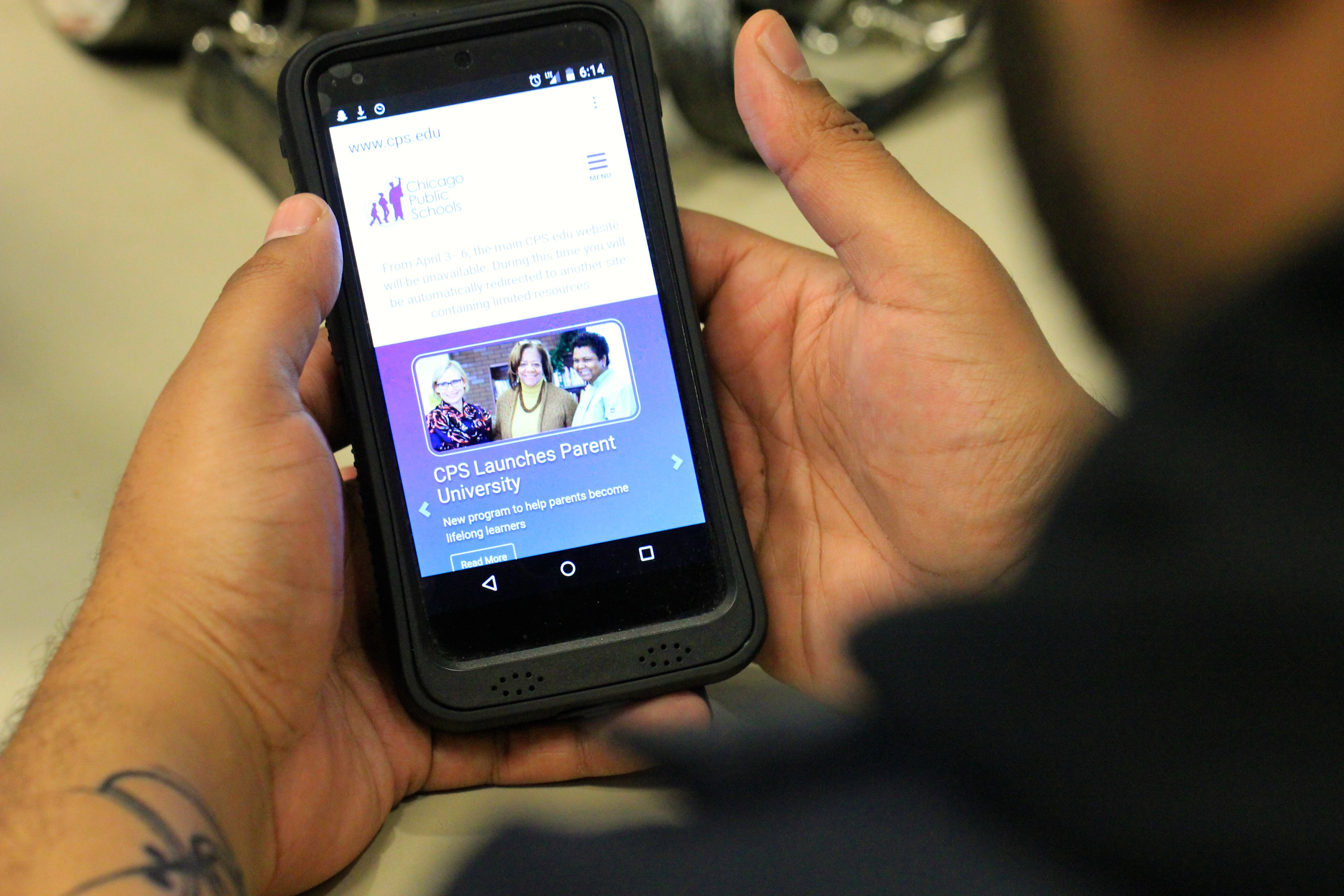
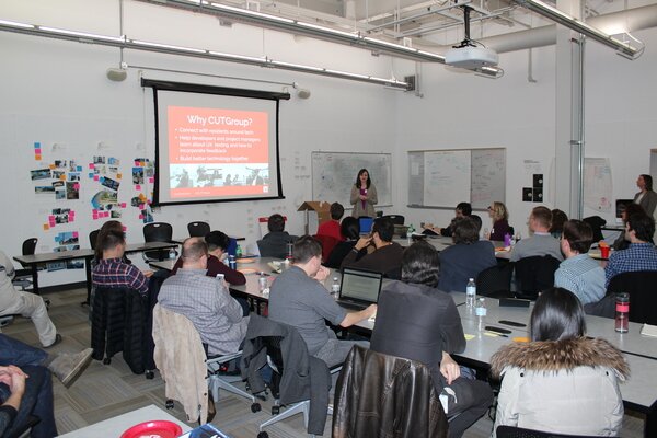
Jay Van Patten, Information Technology Director at Chicago Public Schools, stopped by OpenGov Hack Night on October 7th to showcase his team’s work in redesigning the Chicago Public Schools website to be mobile – first. Their work provides an example of how governments can build great websites all in-house.
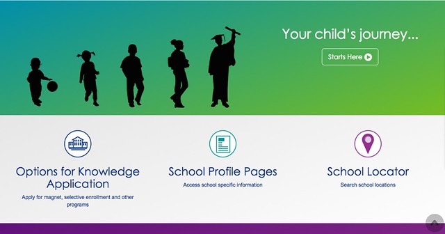
To give some background, The CPS IT team first started experimenting with building their own sites about a year and a half ago when it built a school locator using Derek Eder’s Searchable Map Template. When they launched it, they presented the site at the both the OpenGov Hack Night and the OpenGov Chicago meetup and were able to get very specific feedback on the site. That small win inspired Chicago Public Schools to go bigger.
The Chicago Public School website is now responsively designed and uses Twitter bootstrap. The team didn’t have a lot of funding to do the redesign and so open source became an attractive option. The team also noticed that they were getting a lot of visitors to the site that were using mobile devices. This was occurring mostly in the evening as parents were checking in on what was going on with their school the next day. Ensuring the site was mobile friendly became a priority of the IT team. The team also wanted to make sure that searching for content on the site was much easier.
Back in 2008, the CPS hired a company to come in and re-brand the site – even going as far as to hire an offshore consultant in India to help build it. The site redesign cost CPS almost half a million dollars. This latest redesign was an inhouse side project and didn’t cost the district any additional funds.
To build the site, the team worked on small wins by redesigning smaller portions of the site. As the team become more confident, they worked to redesign the entire website. (Which at the time had 3,000 web pages!)
As part of the project, they created a new web governance policy as cleaned up the content to make the site more concise. Now, departments are responsible for updating and maintaining their own content. To encourage this, they’ve build a warning banner for the site that tells users if the content is old.
Here’s the slides from Jay’s presentation as well as the video. Jay’s presentation is about 13 minutes and the rest is questions and answers from the audience.
The next step for the site is to undergo user testing through the CUTgroup. If you’d like to help with user testing for cps.edu – sign up here!
