Potholes and Crime Stats – A Useful Package for Cleaning Data

Note: this is a guest post from Geoffrey Hing from FreeGeek Chicago. FreeGeek Chicago is working with us on a project to help analyze and visualize Cook County conviction data obtained through a FOIA request by the Chicago Justice Project. As part of the project, Geoffrey created a set of open source packages that we think will be useful to the overall civic innovation community.   —DXO

Potholes are an ever-present nuisance for Chicago residents. While not the biggest challenge facing Chicagoans, they make the navigation of the city in day-to-day life more frustrating. This year, I’ve lost a car rim and had numerous near-crashes on my bike due to these street craters. I often feel like the blocks where streets have new pavement or have had the largest potholes filled in are more exceptional than the rutted norm.Working with open data, I often run into problems that feel like potholes. They’re small, solvable, problems, but they make it harder to get to the bigger problem or the new insight. These are the kinds of problems where dozens of civic hackers have hacked around the same little problems, their solutions burried somewhere in their code repositories. Working on a project covering records of convictions in Cook County criminal courts, our project team ran into one of these data potholes.Who will watch the watchmen? Reed!

We wanted to analyze the number of convictions and variance in sentencing based on the type of offense. We wanted to roll up the statutes under which people were convicted into a common, easily understandable set of offenses and categories. We decided to use the offenses that are part of the Illinois Uniform Crime Reporting(IUCR) program for our analysis. However, our data didn’t have fields mapping each record to an IUCR offense. Instead it had fields describing the statute under either the Illinois Revised Statutes (ILRS) or the Illinois Compiled Statutes (ILCS). This page on the General Assembly website was the best reference I could find describing the differences between how laws are referenced in the two law compilations. The Illinois State Police published a crosswalk between ILCS statutes and IUCR offenses but it was in PDF format and not very useful for processing the thousands of records we needed. Furthermore, our data had references to both ILRS and ILCS statutes and we needed to convert the ILRS statute to an ILCS one in order to look up the IUCR code.

Values for statutes in our data set look like this:

38-12-4
38 9-1E
38-19-1-A
38-18-1-A
38   18-2
38   11-1
720-5/24-1.1(a)
720-5/21-1.3(a)

I ended up implementing an ilcs package for converting the ILRS references to ILCS references and an iucrpackage for looking up an IUCR offense based on an ILCS reference.

It’s just CSV!

There isn’t much to the Python code in these packacges. Essentially, they provide classes that allow statues or offenses to have a string representation, compared and used as keys in dictionaries.

The packages just wrap CSV versions of the crosswalks provided by the states. This isn’t the most performant solution, because it requires that the CSV be parsed when the packages are imported, but I wanted to make it easy for people to update the data, use the data in a spreadsheet or database without using the Python interface, or implement similar functionality in other programming languages.

You can view or download the raw CSV data for the ILCS package here and for the IUCR package here.

Using the packages

Let’s look at an example of looking up an IUCR offense from an ILRS reference:

>>> import ilcs, iucr
>>> import re
>>> ilrs_re = re.compile(r'(?P<chapter>\d+)-(?P<paragraph>[-0-9]+)')
>>> # This is an example of an ILRS reference from our data
... ilrs_ref = '38-12-4'
>>> 
>>> # Parse the reference into chapter and paragraph parts
... m = ilrs_re.match(ilrs_ref)
>>> chapter, paragraph = m.groups()
>>> 
>>> # Lookup the ILCS section from the ILRS reference
... # Note that the lookup functions return lists because some ILRS sections
... # map to multiple ILCS sections
... ilcs_section = ilcs.lookup_by_ilrs(chapter=chapter, paragraph=paragraph)[0]
>>> 
>>> # The section object can evaluate to a nicely formatted string
... print(ilcs_section)
720 ILCS 5/12-4
>>> 
>>> # And you can access its individual components
... print(ilcs_section.chapter, ilcs_section.act_prefix, ilcs_section.section)
720 5 12-4
>>> 
>>> # Now let's look up the IUCR offense.
... # Again, the lookup function returns a list because in some cases,
... # an ILCS statute maps to multiple offenses
... iucr_offense = iucr.lookup_by_ilcs(ilcs_section.chapter, ilcs_section.act_prefix, ilcs_section.section)[0]
>>> 
>>> # An Offense object has various useful attributes
... print("The 4-digit code for the offense is {}".format(iucr_offense.code))
The 4-digit code for the offense is 0410
>>> print("The description of the offense is {}".format(iucr_offense.offense))
The description of the offense is Aggravated Battery
>>> print("The category of the offense is {}".format(iucr_offense.offense_category))
The category of the offense is Battery

Improvements

These are a few areas where I could imagine improvements for the packages.

We’d love to hear about your use cases for these packages, get updates or corrections to the underlying CSV data, suggestions for improvements to the API, or pull requests implementing them.

The best way to provide this feedback is by opening an issue or a pull request through the GitHub repositories for the python-ilcs or python-iucr packages.

Documentation

There are docstrings for the public API of the packages, so you can do something like:

import ilcs
help(ilcs)
help(ilcs.lookup_by_ilrs)

and get some help about the classes and functions in the packages. However, as the API matures, it would be nice to have Sphinx-generated HTML documentation for the packacges.

Exceptions

Currently, the KeyError exceptions trickle up when looking up ILCS sections or IUCR offenses. It’s probably better to catch these and raise more domain-specific exceptions.

Fuzzy lookup or parsing

In our dataset, statutes were referenced in a variety of formats, often including subsection references. Because of this, we couldn’t just pass the raw values to the lookup functions in our packages. It might be good to add functions for parsing strings containing statute references into more standardized formats that can be used with the lookup functions, or using something like jellyfish for doing approximate string matching.

CUTGroup #9 – Foodborne Chicago

We conducted our ninth Civic User Testing Group as a part of a grant from the John S. and James L. Knight Foundation to build communication strategies to engage with targeted communities through Foodborne Chicago, an app that searches Twitter for tweets related to food poisoning and helps report these incidents to the Chicago Department of Public Health.

foodborne_chicago_logo-6152ce094137b0976f8eef52a7944833

Here are the outcomes we will achieve through the Knight grant:

This project will result in improved communications strategies for targeting key cultural groups on social media. The team will conduct research activities to identify the best approaches for communicating with these groups, implement and test new strategies in Food Bourne software and release a report with the findings of the research.

Continue reading

Developer Resource: Twilio

We love text.

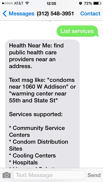
And as big fans of texting, Smart Chicago has had Twilio as part of our offerings for civic developers since the say we started the program.  We’ve recently expanded our partnership with Twilio, and their local developer relations guru, Greg Bagues, to offer Twilio as a separate service through Smart Chicago. Twilio is a great product that makes it easy to create apps that can make and receive both calls and texts.


Healthnear.me

We use it in our own products:

We are also a customer of Textizen, which uses Twilio, including around the Creative Chicago Expo. Civic software developers like Chris Gansen use it to power apps like HealthNearMe.

Like we said, we’re big fans of texting. If you’re new to Twilio, we’ve put together a how-to post of how the app works.

If you’re a civic developer and are interested in using Twilio for your app, please fill out the form below.

Gift Cards for CUTGroup

The Code for America Chattanooga team recently expressed interest in learning more about the operations of CUTGroup to begin their own civic user testing group. Smart Chicago is dedicated to openly documenting  our work for everyone to use. The Chattanooga team reviewed our documentation, we talked further and realized we were missing information about gift card mechanisms.  In this blog post, we will share what we learned about gift cards.

Once a resident signs up to be part of the CUTGroup, we send them a $5 VISA gift card. If and when they are chosen to test a civic app, we give them a $20 VISA gift card.

When purchasing gift cards for your program, there are three main considerations: type of cards, cost and fees associated per card, and quantity and expiration date.

Types of Gift Cards

There are different types of gift cards out there – prepaid VISA of Mastercard gift cards, store-issued, bank-issued, online, etc.

We considered Amazon gift cards as an option; these gift cards do not have  card processing fees, no expiration dates, you can choose small face values (as low as $0.15), and they can be sent directly from e-mail. This is a very convenient option, but by choosing this service we would assume that CUTGroup members have regular access to their e-mail, know how to use  Amazon, and know how to access and use the gift card for their purchase. If someone is not an Amazon user, this could be a barrier to joining the CUTGroup. We want to include everyone, and this just does not work.

Other gift card types also include specific store- or bank-issued gift cards. Sites like ScripSmart  can provide comparisons between gift cards, and can give you an idea of what you need to ask about before purchasing your own cards. Again, our goal is to provide the most flexible currency possible, so this does not work for us.

We purchase VISA gift cards specifically because they can be broadly used in different locations. It is important that CUTGroup spans all different types of residents in Chicago, and these gift cards should fit in the normal course of these residents’ lives. By purchasing these cards, we are spending more than face value on fees, and have to take time to mail them out, but the value of accessible gift cards is worthwhile to the goals of our organization and this program.

Costs and Fees

It can be hard to find companies that offer Mastercard or Visa gift cards in values smaller than $20. In addition, there are a number of costs and fees associated with each gift card. With our first vendor, we spent around $10 for each $5 sign-up card that we sent out. Here is a list of our costs associated with a 100 card order:

  • Face-value of card: $5.00 per card
  • Card processing fee: $3.95 per card
  • Credit card processing fee: $1.00 per card
  • Shipping Fee: $21.95
  • Total: $10.17 per card

The card processing fee can be higher or lower depending on the quantity of cards purchased, how you are planning to pay, and lastly the length of expiration date.

With this in mind, we researched and found an option to lower our fees and have a longer expiration date through a new vendor, Awards2Go Visa Award Card. We were able to lower the cost per card to approximately $7.07 for every $5 sign-up card.  Here are the new costs associated with a 100 card order:

  • Face-value of card: $5.00
  • Card processing fee: $1.75
  • Credit Card processing fee (1% of total order): $5.00
  • Shipping Fee: $27.00
  • Total: $7.07 per card

Expiration Date

Last October, we learned that we still had a lot of gift cards that were about to expire and some were already expired. With the gift cards that expired, we lost out because the cost of the fees to “restock” the cards would be higher than the value of the cards we would receive.  We also had 118 $20 and 103 $5 gift cards that were going to expire at the end of November. If we sent back these cards to the vendor, we would only receive $10 for each $20 gift card.

We thought of some creative ways to use the cards including a refer a friend campaign, and a remote CUTGroup test that allowed many testers to participate. Still, some of our testers received cards late (after the expiration date), and we had to send new cards to our testers. We now have gift cards  that have expiration dates set for 8 years later, with the value decreasing from the card after 13 months of receiving the cards (-$2.50/month). This gives CUTGroup participants a longer time frame to use the cards, but at the same time we still have to be mindful of the quantities we purchase to ensure we can use them before they lose value.

Final Thoughts

The success of CUTGroup operations is based on the quality of engagement with our residents and the open communication we have about our process. When our gift cards were about to expire, we told our CUTGroup members so they knew. When gift cards came too late, they e-mailed us to let us know, and we sent out a new card. These everyday conversations let us build a better community with Chicago residents around data and technology, and help us be better at what we do.

CUTGroup is an important program to Smart Chicago because it cuts across three of our areas of focus on access, skills, and data. Not only does it allow residents to connect around data and technology, it also creates meaningful communication between developers and residents. We will continue to share our processes around our programs in hopes that our experiences are useful to everyone.

CUTGroup #8: Waitbot

For our eighth Civic User Testing Group session, we tested the Waitbot app, which is a place where you can find wait time estimates for all sorts of things, including transit, restaurants, airports, and more. This test had an in-person and a remote component to it. The in-person test took place at one of the Connect Chicago locations – Chicago Public Library Clearing Branch at 6423 W. 63rd Place in the Clearing neighborhood.

Through this test, we were interested in finding answers to these questions:

  • What makes users download an app? Delete an app?
  • Do users want to use Waitbot on a daily basis? Why or why not?
  • What features do users want?
  • What other wait categories would users want to see?
  • Do users want to share wait time information on social media?

Segmenting

On March 5, we sent out an e-mail to all of our 749 CUTGroup participants. We asked them if they would be willing to test a wait time estimates app on March 12, 2014. We asked some screening questions to gather information, and chose our group of participants based on a diverse selection of answers and also device types.

We were interested in having about 15 participants from different Chicago neighborhoods, but only had 6 testers come to test in-person. A lot of testers could not come due to a combination of weather and distance, so we reached out to 4 more testers to do the test remotely.

In the end, we had 10 testers participate in the test, although 1 tester could not get the app to load and could not fully participate in the test.

Here is a look at which neighborhoods our testers came from:

View CUTGroup 8: Waitbot Participants in a full screen map

 Test Format

For the in-person test, proctors were able to work with testers one-on-one. Testers looked at the app on their own devices and provided feedback, while the proctors wrote down notes. After the test, we sent out additional (and optional) questions to see if testers were using the app and how they liked the app in their own neighborhood.

For the remote test we asked testers to use the app on their own and provided questions to lead them through the test.

In the end, we got great responses from both types of tests.

Results

Before this test, testers generally associated apps that estimate wait times with transit apps. 9 out of 10 testers used Web sites or apps to check wait times. Some apps that testers use for wait times include CTA Bus Tracker, Transit Tracks, and Transit Stop.

Even during the test when testers were offered wait times for other establishments, most testers (7 out of 10) thought the Transit page was still the most useful, and the other three pages (Restaurants, Airports, Emergency Medical) were equally considered the least useful page.

In addition, after looking at the Transit page, testers were not drawn to do one thing over another, and there was not a logical course of action of what to do next.

What makes users download an app? Delete an app?

5 out of 10 testers mentioned that they would download or keep any app if they routinely used it and if it was easy to use. Other considerations included whether it was a low-cost or free, and if it had good recommendations or reviews from others.

Do users want to use Waitbot on a daily basis? Why or why not?

67% of testers (6) liked the Waitbot app and said they would use the app again after the test. Testers who did not like the app did not have many options populate for them and did not think they would use all of the features.

78% of testers (7) found the Transit page the most useful.  In terms of using Waitbot on a daily basis, transit is a key way for users to use Waitbot on a daily basis.

What features do users want? How can Waitbot be improved?

  • Only 1 tester liked the Map view option over the List view. The majority of testers liked the list view because it gave more information and was better organized than the map view. It was in general easier to use
  • There was confusion regarding the color coding and what the colors meant in terms of wait time. 1 tester thought that the color referred to the CTA line
  • Testers are interested in seeing more details and information for each page. In addition, besides the Transit page, testers did not have many options and a lot of places had “No report.” Testers were not immediately aware what this referred to

“Add Wait” was not particularly a well understood feature of the Waitbot app.

  • Two testers chose it after looking at the “Transit” option because they were curious of what it did
  • 4 out of 9 testers did not clearly understand what this feature would be used for. One tester saw this option as only for the establishments to add, not necessarily residents. Another tester clicked on “Add wait time” while on the Emergency Medical page and it gave him a wait time screen
  • 3 out of 9 testers said it seems easy to use, and was straight-forward

A tester, I like Cacti (#4), said he would add wait times:

“If there’s enough data and it’s actually helping people. When I am at a restaurant and the line is really long, it’s a way to complain about it.”

What other wait categories would users want to see?

Of the categories “Coming Soon,” the top categories testers were interested in included:

  • Government Services
  • Tourist Attractions
  • Barber Shop
  • Nightlife

Other categories, testers wanted to see included:

  • DMV
  • Grocery Store lines
  • Movies
  • Gas Stations

Do users want to share on social media?

Most testers were not interested in sharing this type of information on social media. One tester would share on Facebook only if it was automatically connected, while another tester said he would not do it unless there was an incentive. Only 3  out of 10 testers would share on social media.

Conclusion

When testing the Waitbot app, testers liked the Transit page and the fact that it populated with nearby options. There was some confusion with color-coding and testers wanted added features such as route display. However, testers overwhelmingly liked this page.

One tester, My eyes are dried out (#10), explains why he doesn’t like the Waitbot app in general, but thought that the Transit page was the most useful:

“The Swiss army knife is useful and practical. Then the impostors ‘improved on it,’ making it bigger and more cluttered with useless features. Sometimes I feel app creators want to entice a large crown, instead of just perfecting one good thing.”

The Transit page is the one that testers would use consistently, while some testers might check Restaurant wait times. Airports and Emergency Medical categories are both categories that people would not base their decisions on before using. Lastly, testers said that the restaurant category did not have enough information about the establishments, or no wait times were represented. The majority of testers liked the app (67%), and thought it was an interesting concept, but without more wait time information or categories that users would check to base future decisions on, it is difficult to state if users would use Waitbot on a regular basis.

Final Report

Here is a final report of the results with key highlights from our CUTGroup test, followed by each tester’s responses, and copies of our e-mail campaigns and the questions we asked:

The raw test data can be found below with complete answers from every tester.


The Glories of User Testing: Chicago Early Learning

In late 2012, after a short development process, we launched an initial version of our project called Chicago Early Learning.

Chicago Early Learning

The first manifestation of a search results page for ChicagoEarly Learning.

An active regime of testing

Then, in the ensuing months, we actively listened to regular Chicago residents, dutifully noted their feedback, and directly changed the site so that it worked better for our target audience of Chicago parents and guardians looking for early childhood education. Here’s a review of the process and the results.

CPS Head Start Policy Committee Meeting

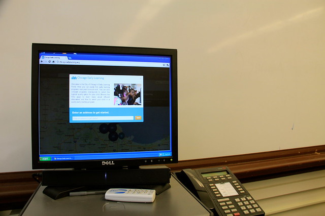
We showed the site on a typical computer set up inside a Chicago Public School location.

CPS Head Start Policy Committee Meeting

We demonstrated the site at a CPS Head Start Policy Committee Meeting At Zenos Colman Elementary School, 4650 S. Dearborn.

Presenting the Early Childhood Portal as 37th Ward Alderman Emma Mitts Looks On

We presented the site to block club leaders inside the ward office of as 37th Ward Alderman Emma Mitts.

User Testing, Chicago Early Learning

We also tested the site in formal environments inside Action for Children locations in Chicago.

Changes to the site based on user feedback

Softer, less map-y design

We completely overhauled the look & feel of the site, making it softer and more rounded. Lots of users we talked to had childcare needs in different areas of the city or related to different parts of their lives (home, work, and relatives, for instance).  For this reason, we also moved away from a stark search box and toward explanations of how to approach the site. We added explanatory text that short-circuited the most common question.  We also moved from book imagery to a crayon/ marker in the logo to better reflect the programs that parents were looking for.

Chicago Early Learning, Relaunch, September 2013

More prominent text feature

The text feature, which allows residents to text a zip code to a special number and receive a set of nearby location, was very popular in testing. We did notice that texting was hidden in the navigation, so we added a paragraph highlighting the feature. We also made the text phone number easier to see and share by giving it a separate page with a separate URL.

Text feature on Chicago Early Learning

Improved search that helped you along

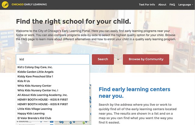
We saw that many people started off their search with a location in mind, whether it was a school or a neighborhood. We moved away from a pure address search and now pre-populate the search box as the user types. This short-circuits the search process and makes people immediately feel like this is a place that has what they’re looking for. The “Browse by community” function provides another way for people to dive in without putting in an exact address.

Chicago Early Learning Search for "kid"

Improved filtering for more user control

We found in testing that people did not know how to easily drill down into search results and they very rarely used the filtering feature. We made the filtering more prominent and took up much more screen real estate with details of the search results. Previously, the user had to click on a particular item on the map to reveal details. An overall insight we observed from testing was that the map is not the thing—the details of early learning centers was the thing. We changed the interface to reflect this.

Chicago Early Learning Search

Better comparisons– more locations, easier to share

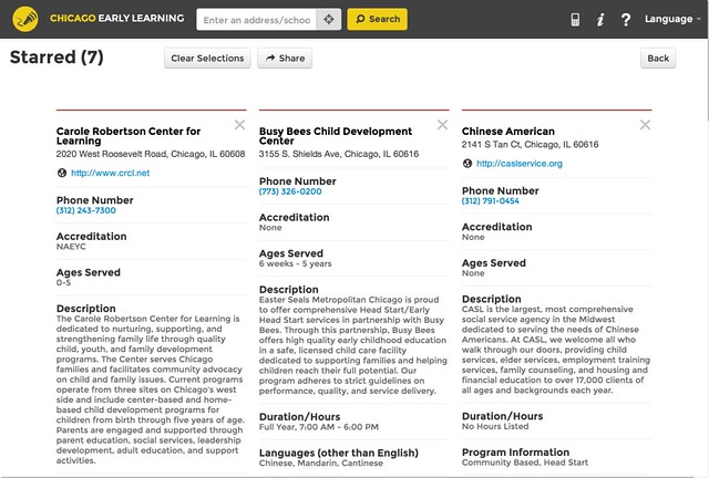
One thing we heard loud and clear from parents was that they wanted to be able to compare more than two locations. In response, we completely changed the comparison system—changing it to a more recognizable star / favorite system, displaying starred items in a grid, and giving the user the flexibility to easily add and remove locations.

Chicago Early Learning Compare

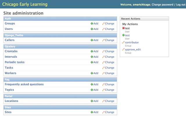
Admin tool for management beyond the spreadsheet

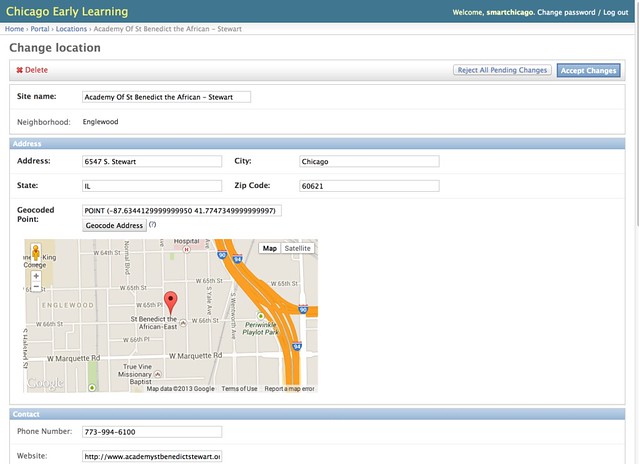
An important milestone in this reporting period is the creation of an easy-to-use admin tool to manage all of the locations. Previously, the site was run by a “magic spreadsheet” that was difficult to manage. The Django admin interface to the rescue!

Site administration Chicago Early Learning Portal adminThe admin search tool allows you to drill down quickly
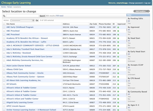
Select location to change Chicago Early Learning Portal admin

And location detail pages are managed through a simple web form

Change location Chicago Early Learning Portal admin benedict

Conclusion

The process of engaging Chicago residents with this tool has been very rewarding. Since we started this project– and in part based on what we learned here– we started the CUTGroup, a set of regular Chicago residents who get paid to test civic apps. This kind of back-and-forth helps developers, government, and residents communicate with each other and make our lives better.