We’re deep into work on the next phase of our Chicago Early Learning. The key work here is to turn the existing system from a sortable web listing of locations into a robust jumping off point for parents and caregivers seeking to enroll their children. Here’s some of the work ahead:
Chicago Early Learning
The Glories of User Testing: Chicago Early Learning
In late 2012, after a short development process, we launched an initial version of our project called Chicago Early Learning.

The first manifestation of a search results page for ChicagoEarly Learning.
An active regime of testing
Then, in the ensuing months, we actively listened to regular Chicago residents, dutifully noted their feedback, and directly changed the site so that it worked better for our target audience of Chicago parents and guardians looking for early childhood education. Here’s a review of the process and the results.
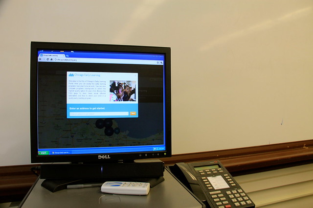
We showed the site on a typical computer set up inside a Chicago Public School location.

We demonstrated the site at a CPS Head Start Policy Committee Meeting At Zenos Colman Elementary School, 4650 S. Dearborn.

We presented the site to block club leaders inside the ward office of as 37th Ward Alderman Emma Mitts.

We also tested the site in formal environments inside Action for Children locations in Chicago.
Changes to the site based on user feedback
Softer, less map-y design
We completely overhauled the look & feel of the site, making it softer and more rounded. Lots of users we talked to had childcare needs in different areas of the city or related to different parts of their lives (home, work, and relatives, for instance). For this reason, we also moved away from a stark search box and toward explanations of how to approach the site. We added explanatory text that short-circuited the most common question. We also moved from book imagery to a crayon/ marker in the logo to better reflect the programs that parents were looking for.

More prominent text feature
The text feature, which allows residents to text a zip code to a special number and receive a set of nearby location, was very popular in testing. We did notice that texting was hidden in the navigation, so we added a paragraph highlighting the feature. We also made the text phone number easier to see and share by giving it a separate page with a separate URL.

Improved search that helped you along
We saw that many people started off their search with a location in mind, whether it was a school or a neighborhood. We moved away from a pure address search and now pre-populate the search box as the user types. This short-circuits the search process and makes people immediately feel like this is a place that has what they’re looking for. The “Browse by community” function provides another way for people to dive in without putting in an exact address.
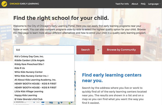
Improved filtering for more user control
We found in testing that people did not know how to easily drill down into search results and they very rarely used the filtering feature. We made the filtering more prominent and took up much more screen real estate with details of the search results. Previously, the user had to click on a particular item on the map to reveal details. An overall insight we observed from testing was that the map is not the thing—the details of early learning centers was the thing. We changed the interface to reflect this.

Better comparisons– more locations, easier to share
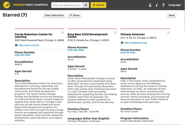
One thing we heard loud and clear from parents was that they wanted to be able to compare more than two locations. In response, we completely changed the comparison system—changing it to a more recognizable star / favorite system, displaying starred items in a grid, and giving the user the flexibility to easily add and remove locations.
Admin tool for management beyond the spreadsheet
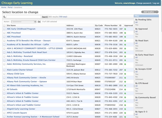
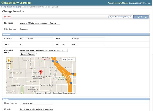
An important milestone in this reporting period is the creation of an easy-to-use admin tool to manage all of the locations. Previously, the site was run by a “magic spreadsheet” that was difficult to manage. The Django admin interface to the rescue!
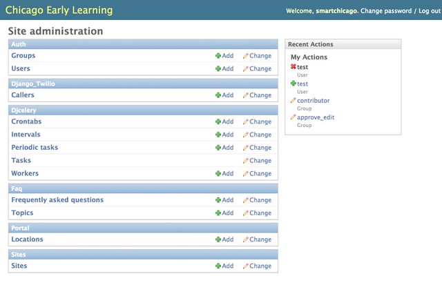 The admin search tool allows you to drill down quickly
And location detail pages are managed through a simple web form
Conclusion
The process of engaging Chicago residents with this tool has been very rewarding. Since we started this project– and in part based on what we learned here– we started the CUTGroup, a set of regular Chicago residents who get paid to test civic apps. This kind of back-and-forth helps developers, government, and residents communicate with each other and make our lives better.
The Chicago Early Learning Portal: A One-Stop Shop to Find Important Data About Chicago’s Early Childhood Programs (Azavea Journal)
The Chicago Early Learning Portal: A One-Stop Shop. Snip:
An interesting challenge the design team will face in the upcoming work will be to refine the SMS interface to the application. During the usability tests and demos of the application, we’ve received a lot of excited feedback about this feature. It provides a way for users to access the data behind the application by sending and receiving text messages. There is a dearth of resources that describe good user experience (UX) design in the realm of SMS interfaces, so through the examination of existing SMS products and iterative redesign, we are looking forward to learning some of the tricks to creating a great SMS user experience.
Chicago Launches Website to Help Parents Find Preschool Programs (Education Week)
Here’s an article about Chicago Early Learning in Education Week.
Snip:
The website, complete with an interactive map, helps parents find neighborhood options by entering their addresses and provides information so they can compare programs. A texting feature is available so parents can get information on their phones without having to access the Internet. The site also notes which programs are “accredited through the National Association for the Education of Young Children and will eventually include information about each program’s statewide rating once the Illinois Quality Rating Improvement System is launched,” the release say
City Offers Early Learning Info Online (CBS Chicago)
Snip:
If you’re looking for early education programs for your kids, the City of Chicago has a new, online tool.
The early learning portal is a new website with information about hundreds of neighborhood programs.
And a look at the accompanying video:
Review of Chicago Early Learning Portal on CBS with Kevin Hauswirth from Daniel X. O’Neil on Vimeo.
The Launch of Chicago Early Learning
Today marked the launch of Chicago Early Learning, a new way to find and compare early learning programs in Chicago.
Here’s some snips from the press release from the Mayor’s Office:
As part of the his administration’s focus on increasing access to quality early learning programs for children across the city and emphasis on helping parents get and stay involved in their children’s education, Mayor Rahm Emanuel today launched a new online Early Leaning Portal, www.chicagoearlylearning.org. The portal is an easy-to-use, interactive website that puts information about hundreds of quality early learning programs across the city all in one place.
*
“We were happy to collaborate with the City on this interactive map, which will allow parents and families to find information about these programs easily and quickly. We’re interested in hearing from parents and caregivers on what would make the site more useful to them,” said Dan O’Neil, Executive Director of the Smart Chicago Collaborative. “We’re also releasing the code for the site as open source, so that it can be used to make similar map-based sites showing resources across the city.”
“Our focus is on making sure children are ready to learn when they enter kindergarten. M.K. and I share Mayor Emanuel’s strong commitment to providing high-quality early learning for infants, toddlers and their families,” said J.B. Pritzker, president of the J.B. & M.K. Pritzker Family Foundation. “Helping Chicago parents and caregivers identify the best early childhood educational opportunities in their neighborhoods is critically important. This online interactive, one-stop shop will help parents and caregivers access and better manage the challenging process of selecting a high-quality early learning program for their infants and toddlers.”
Here’s the code that drives the site.
Here’s a spot on CBS about the site featuring Kevin Hauswirth of the Mayor’s Office:
Review of Chicago Early Learning Portal on CBS with Kevin Hauswirth from Daniel X. O’Neil on Vimeo.
We worked with a really great team to get this first phase of the Web site launched:
- At Smart Chicago, we had consultant Derek Eder of DataMade. Derek served as local technical technical project manager and was instrumental in getting the data for the site in good order
- Azavea, a leading geospatial firm out of Philadelphia, did the heavy lifting around technology
- The Urban Education Lab of the University of Chicago shepherded the project from the education perspective and worked with other stakeholders like Illinois Action for Children to make sure that the data was sound and the interface was useful key constiuents
We look forward to working toward a successful phase two, which will incorporate feedback from user testing we’ll be conducting in the months to come. Questions, comments, and feedback are always welcome at
