Recap of the Digital Inclusion Leadership Awards at #NLC15

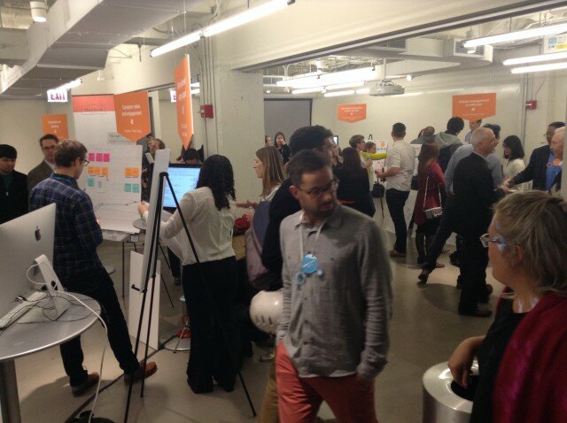
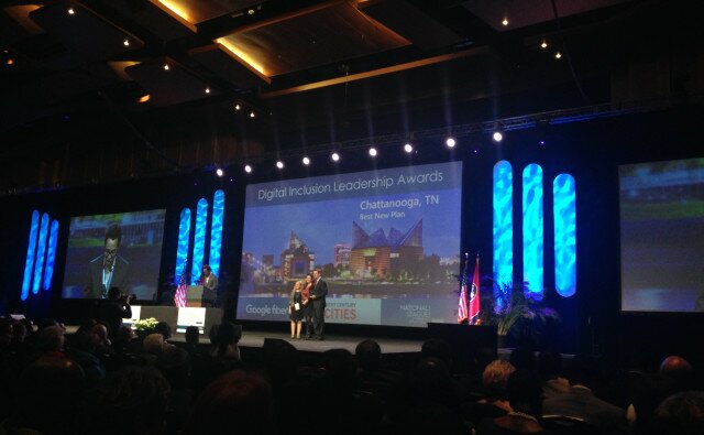
Smart Chicago was at  the National League of Cities 2015 Congress of Cities in Nashville, TN to help distribute the first annual Digital Inclusion Leadership Awards. The awards were created by Next Century Cities and the National League of Cities in partnership with Google Fiber to recognize municipalities that have made major strides and investments in closing their digital divides.

Chatt pic for blog

I assisted with the planning and judging of these awards. As a Program Analyst for Smart Chicago working for the Connect Chicago Initiative, I have have had the privilege to be part of this cross-city, cross-sector community of practitioners who think about the digital divide everyday.

Over 30 city governments applied for the awards. From mobile tech vans to matching technology grant programs, these city-supported programs have helped helped get more residents online.

Here are the winners:

Screen Shot 2015-11-17 at 11.24.37 AM

You can read cases about the winners and each winning program here!

How to Get More Residents Online

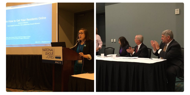
At the Congress of Cities, I moderated a Solutions Session with two of the Digital Inclusion Leadership Award winners: Austin, TX and Davidson, NC. The cities were invited to describe their winning programs and give concrete, specific recommendations to other municipalities seeking to replicate their work.

Screen Shot Panel

I found both of these cases to be compelling. Austin’s Digital Assessment survey work (conducted every three years) is a great model for institutionalizing the regular collection of essential Internet access and use data across neighborhoods. Davidson’s Eliminate the Digital Divide Program featured the clever “Squeeze Out the Digital Divide” – a part fundraiser, part youth-driven community awareness campaign that uses lemonade stand revenue to fund devices for school-age children.

Here is the full presentation from the Solution Session:

Lessons for Chicago

Back in 2009, the American Reinvestment & Recovery Act infused Broadband Technology Opportunity Fund grant money into many cities to help close the digital divide. Cities like Chicago and the ones above are all experimenting with ways to institutionalize digital inclusion work in the aftermath of that grant funding – whether it’s device lending and refurbishment, public computing labs, awareness campaigns, Internet access survey work, and digital training programs.

This is why Connect Chicago is so important. We’re working with partners all over the city – both public and private – to coordinate Chicago’s digital access and skills ecosystem and support the trainers on the front lines of digital inclusion work.

One thing I noticed was that almost every winning city from the Digital Inclusion Leadership Award had a City Hall Champion in the form of a mayor, an agency head, or a department. Connect Chicago benefits from both the Mayor’s office and the Chicago Department of Innovation & Technology being on its Steering Committee. This involvement sends a clear message: the digital life of every Chicagoan matters.

Despite the great work being done in the field, there are untapped opportunities for  innovation and experimentation. At Smart Chicago, we want to understand how to increase and strengthen the network of digital access and skills resources across the City. Specifically we’re thinking about:

  • How to create referral systems for training across decentralized, but complementary services
  • How to track digital access and skills outcomes. Though we can collect data on participation and certification
  • How to engage with residents about their desire to learn new digital and technical skills. How do they want to learn? What do they want to learn? What are the obstacles in the way of learning those things?

We know we are not alone in asking these questions. Now, through the Digital Inclusion Leadership Awards and the community of applicants, winners, and best practices that it’s assembled across the country, we have a peer network of organizations to collaborate with.

To become a member of the Digital Inclusion Learning Network, fill out this form. 

Sonja Marziano CUTGroup remarks at Open Indy Meetup

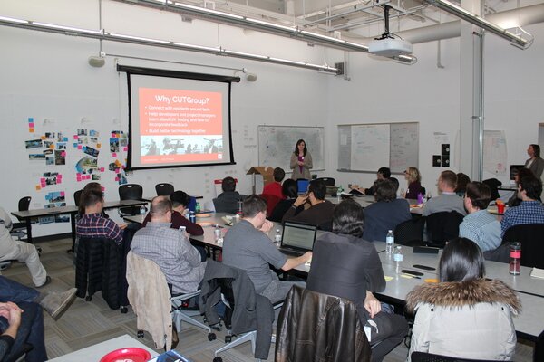
Sonja Marziano presents at Open Indy MeetupOn November 19, I was invited to present about CUTGroup by the Open Indy Brigade as part of a meetup devoted to speaking about user experience (UX). Open Indy also launched their Civic UX project this evening, which is “dedicated to making the apps and websites of local governments across Central Indiana more user-friendly for all citizens.”

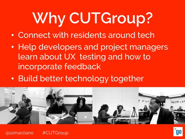
During this presentation, I focused on the importance of our CUTGroup work in helping to change and create better technology using specific examples. I wanted to explain why CUTGroup is an important part of the work we do at Smart Chicago, but also give examples of specific tests where we tested technology that reached a large amount of residents. Some examples included the Chicago Public Schools website or the Ventra app.

CUTGroup Open Indy Slide 4

Overall, this was a great event focused on incorporating the user experience when building new technology and I was glad to be a part of it to share our experiences.

Here is my presentation:
[slideshare id=56528155&doc=cutgroup-presentation-openindybrigade-11-151229171722]

Design Thinking Raises Patients’ Profile to Rehab Health Care Access

At BarnRaise 2015, Mark King collaborates with the Thresholds mental-health agency on outreach to teens.

At BarnRaise 2015, Mark King collaborates with the Thresholds agency on outreach to teens.

When Chicago technologists diagnose health issues, they turn their attention to how patients and practitioners make decisions.

“It’s always important to understand the domain,” says ThoughtWorks user experience designer Bridget Sheerin. “The classic example is, you try not to build something for which there isn’t a problem.” A less obvious trap, she says, is building great technology that can’t or won’t get used in the field.

The Illinois Institute of Technology’s design institute focused health and tech teams on patient interactions in two days of brainstorming Oct. 13 and 14 at its BarnRaise 2015 “maker-conference.” Teams presented their solutions to a health technology crowd at Matter, the Merchandise Mart health-care incubator.

“I was amazed at how effective the conference was at bringing people up to speed about something they knew nothing about,” said Ronald Grais, director of the Thresholds mental health agency. Consultant Mark King of Toad & Tadpole suggested ways Thresholds could encourage peer interventions for troubled teens. Grais plans to test them immediately in schools and community programs.

The 13 teams addressed process and strategy issues as well. Smart Chicago Collaborative anchored one team, working with the Design Concepts agency to build patients’ health and computer literacy.

BarnRaise 2015 partners present their work at the Matter health-care incubator.

BarnRaise 2015 partners present their work at the Matter health-care incubator.

IIT matched software developer ThoughtWorks with Janus Choice and its Virtual Liaison app, which refers hospital patients to long-term care providers. Janus chief technology officer Daryl Palmer says ThoughtWorks brought experience in coaching technologies that complemented Janus’ development talent.

“We wanted to make sure we were looking at the social and cultural mindsets of users at final discharge,” Palmer says. “Patients can’t go home, they have to go to a skilled nursing facility, and we have to explain where they are in the process.”

Janus wanted a better handoff for accident victims, for whom the diagnosis is still sinking in. “We tried through a design process to understand what that experience is like for a patient and a nurse,” says Sheerin. “It’s not about building a prettier interface but understanding the entire journey they go through.”

The team interviewed nurses on how they used the iPad app to locate intensive rehab or continuous care resources. “The nurses are under extreme time pressure to get patients out of the hospital. They need patients to comfortable with the choices they’re making. The device makes the narrowing-down process a lot faster for the patients, which cuts cuts down on the time pressure on the nurses.”

More often it’s nurses or family members using the tablet app to find follow-up care, not the patients themselves. The result has to please all parties, including the hospitals paying for the app. They expect a payoff in better use of their own beds and lower readmission rates.

ThoughtWorks suggested video and other tools to connect nurse recommendations with doctors’ orders, and updates on patients’ rehab progress to keep nurses engaged.

The YMCA of the USA approached rehab from a different angle. It worked with Rêve Consulting to structure pilot programs bringing joint replacement patients into local gyms and swimming pools to shape up before surgery, as well as to recuperate afterward.

Chicago health providers facing widespread issues used BarnRaise partners to plan a local response. The American Medical Women’s Association and the Mad*Pow agency worked to spread stroke awareness.

The BarnRaise collaborators decided they must spread the word about about stroke symptoms to a younger audience, who could act quickly if a family member is stricken.

“Trust is an issue,” says Heather Beckstrom, stroke program coordinator for Mount Sinai Hospital Medical Center. Immigrants fear deportation, while minorities expect a struggle to get the immediate care that can save stroke victims’ lives. “How do you get into a community where there is distrust?”

The solution was to build on relationships with community activists and organizations like the Chicago Housing Authority. “It gives us a different strategy and outlets to tap into,” Beckstrom says.

Taken Charge: Apply for a Free Educational Game for Youth!

How do teachers and trainers get youth digitally skilled, tech literate and job ready? While “coding” might be the first solution that comes to mind, learning to code isn’t the logical starting place for every young person. As Smart Chicago learned from this summer’s Youth-Led Tech program, successfully teaching technology to young people means balancing  foundational concepts and making learning fun.

The new browser-based game Taken Charge has a solution to this dilemma. The game covers a wide array of topics in addition to coding concepts – everything from the parts of a computer, how the Internet works,  and cyberbullying. As they learn new things, gamers earn badges marking their progress. All you need to get started is an Internet connection, and computer, and a 3rd grade reading level.

Read more about Taken Charge in Built in Chicago and see the demo below:

What sets this game apart? Taken Charge has an ISTE Seal of Alignment for Readiness. This means students who play Taken Charge are learning a foundational set of certified standards and skills. According to the ISTE website:

Reviewers determined that this resource helps build foundational technology skills needed to support the ISTE Standards for Students and helps teach students the basics of technology in a fun and motivational way. Players gain valuable knowledge on important technology concepts such as the basics of hardware, essential elements of search engines and websites, fundamentals of networks, appropriate online communication skills, and cyberbullying.

Apply to Get Free Access to the Taken Charge Game

Connect Chicago just purchased student accounts for the Taken Charge game. If you run a youth or digital training program in Chicago and know one or several students who want their own game accounts, please fill out this form!

Please note that a 3rd grade reading level is required to get the most out of Taken Charge. Also note that anyone is eligible to apply for the student accounts. We’re interested in seeing how this game can be used across different neighborhoods, students, and training environments.

We’re excited to learn more about Taken Charge and how gaming can promote STEM learning across Chicago. Apply for free student accounts at this link!


A Taxonomy for Regional Data Ecosystems

This post is about designing a taxonomy for Chicagoland’s data ecosystem, and why a taxonomy would be useful for the growth and development of the ecosystem.

Taxonomies are used in many disciplines to organize knowledge. Carl Linneaus’s taxonomy to classify species — like Homo sapiens — is used today, almost three hundred years later. It’s a good example of a nested hierarchy, where each category is a subset of a broader category. A strong taxonomy has a notation convention for classifying individual items and an organizing principle (or principles!) for putting items in relationships with each other. Structured lists, alphabetical order, numerical order, headers, indexes, tables of contents, the branching diagram, all kinds of finding aides — these things are so common now, most people take reference tools for granted. So what?
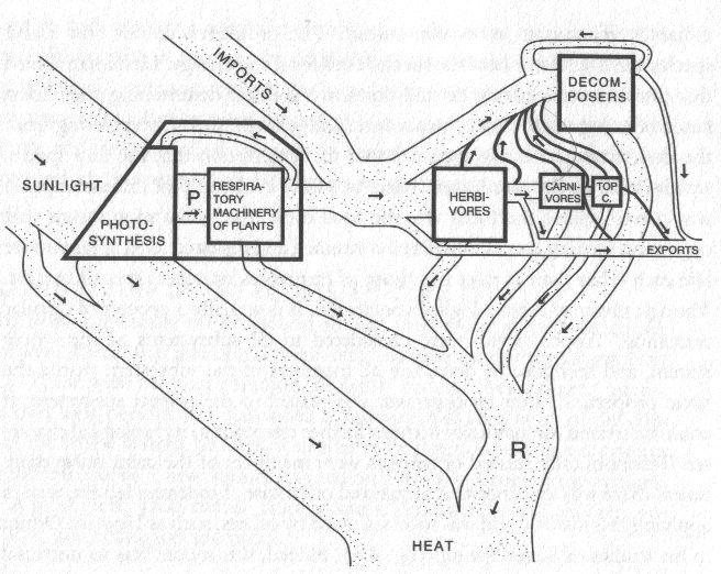
This is a diagram from Howard T. Odum’s 1971 study of Silver Springs, Florida, an early, pioneering effort to model the thermodynamic and material flows for an ecosystem. What are the elements of a data ecosystem?

The Ecosystem Project

The warrant for Smart Chicago’s “ecosystem project” is to build with, not for, to be at the service of people. Enter the Chicago School of Data. We’ve done interviews, surveys, a convening, and are writing a  book dedicated to how we shape Chicagoland’s data ecosystem to fit the needs of people in Chicagoland. Thanks to our documenters, the convening had an unprecedented amount of raw, in-the-moment documentation. We’ve classified these resources, archived them, and analyzed parts of the data already — data about how organizations in Chicagoland put data to work (how meta!). Now we need to make sure our work doesn’t collect dust. A taxonomy for Chicagoland’s regional ecosystem would turn our documentation into actionable intelligence.

I’m helping develop the structure of this taxonomy so it works for the community. The taxonomy is a way to format data about organizations who participate in the regional ecosystem. With structured metadata, we’ll be able to manage the knowledge we have about these organizations, such as organizations’ sizes, missions, and skill gaps. Regardless if this or a version of this specific structure is used, an established taxonomy for managing knowledge about data ecosystems is a good idea. It will accelerate the hardest parts of building capacity, building technology skills, and building coalitions. Designed to get data to work for people, a simple reference directory for organizations in the ecosystem would help organizations find worn paths to cross technology skill gaps. It would help organizations quickly match themselves with other organizations facing similar challenges, sharing similar successes. A taxonomy acts as a backbone for these kind of reference directories.

Originally, we classified Chicago School of Data participants by industry. Participants were either a university, government department, non-profit, or private company. These buckets were useful when we were finding people to interview. We wanted to get as broad a cross-section of the landscape as possible. We didn’t want to miss the perspective of any of our partners. Over time, though, we found that these buckets weren’t specific enough for our purposes. They weren’t organized in a way that told us anything about how our partners really used data. Ideally, we wanted look at an organization’s place in the ecosystem, its niche, and know exactly what support it needed around data and how else the organization could benefit — and be benefited by — the ecosystem.

Landscape Scan

I listened to and transcribed all the interviews and analyzed the pre-convening survey material. I tried to capture what were, by my lights, the main themes brought up during our scan of the ecosystem. I wrote a draft taxonomy in JSON. It’s okay if you don’t know JSON from a day salon. The drafts were guided by the idea that our data should work for people in the ecosystem, people we know and work with every day, and that it’d be easier to work with our project material if it were indexed. I classified ecosystem members, often non-profit organizations, as creators, consumers, and enablers of data. Wide nets, to be sure, so I introduced a few sub-classifications. The teased out data ecosystem looked like this:

  • The data ecosystem has
    • Creators
      • Who open their data for free
      • Who open their data for a price
      • Who don’t open their data
        • Because of technical capacity
        • Because of cost
        • Because of legal agreements
        • Because of the public interest
        • Because of other reasons
    • Consumers
      • Who only consume free data
      • Who pay for some of their data
      • Who use data
        • To evaluate their own operations
        • To evaluate other organizations’ operations
        • And turn it into a digital product
        • And turn it into a printed product
    • Enablers who provide services and goods in the ecosystem such as
      • Volunteers
      • Consultants
      • Funded organizations
      • Paid organizations

This taxonomy gives you a better sense of the ecosystem’s niches, but it amounts to a bunch of redundant lists of participants. An institution as big as Chicago Public Schools, say, is clearly a creator, consumer, and enabler of data in the ecosystem. CPS shares some data while protecting other data. Different departments use data in different ways. One department might focus on general national trends in education policy while another focuses on budget allocation versus tenure within one district. CPS is a good test case. Its multi-faceted role shows that members of the data ecosystem aren’t easily classified.

Survey Responses

After the convening, on September 19th and 20th, 2014, it was clear that the taxonomy needed revision. More detail was important, especially about how participants used data. Through a survey we found lots of ways data works in the ecosystem. I incorporated categories from our survey into the ecosystem, which changed the structure from:

  • The data ecosystem has
    • Consumers
      • Who use data
        • To evaluate their own operations
        • To evaluate other organizations’ operations
        • And turned it into a digital product
        • And turned it into a printed product

to look like this:

  • The data ecosystem has
    • Consumers
      • Who use data for
        • Resource allocation
        • Measuring impact
        • Advocacy and outreach
        • Understanding the needs of people served
        • Donor development
        • Operations
        • Research

Much better! This structure is more specific and it gives you a clearer picture about the many different ways data gets used by organizations in the ecosystem. This set of categories are specific to our ecosystem, given they were after all created in conversation with a specific group of partners mostly from the Chicagoland region for a conference. That said, my bet is that many organizations would say they use data for at least 1 of these 7 reasons. It’s important for any taxonomy to be flexible enough for people to enter and update survey data, though. Surveys are one of the most important instruments in civic technology.

Most of our survey categories are not mutually exclusive. When you look at our 246 participating organizations’ responses, the network of responses they share is extremely dense, with many millions of combinations. Without more metadata, we may as well reference the raw results of the survey, to learn, for example, that desktop spreadsheets are the most used tool among survey respondents. These survey categories are not enough when there’s already data available to see the ins-and-outs of the ecosystem.

Moar Metadata

People have worked hard to classify organizations. We can build off their work. Our taxonomy can incorporate IRS codes, property tax identifiers, budget, size, whatever’s useful. There are several classification systems for economic entities, such as S&P’s Global Industry Classification Standard, Forbes’s Industry Classification Benchmark, the UN’s International Standard Industrial Classifications. The 501(c)3 classification for a non-profit is one of twenty-nine other types of 501(c) organizations. Usefulness for these codes is measured by how many people actually use them to collect and organize data.

Categories developed by the National Center for Charitable Statistics (NCCS) are extremely useful for our ecosystem project and for other regional initiatives trying to get working inventories of their local data ecosystems. The NCCS categories are organized in their National Tax-Exempt Entities taxonomy.

Incorporating our survey data, NCCS categories, and a few federal codes, an organization’s place in the taxonomy might look like this:

  • Organization name
    • Type
      • NTEE Code
        • A54
      • IRS Code
        • 501(c)4
      • EIN
        • 43-219431A
    • Size
      • Revenue
        • $1,000,000
      • Employees
        • 15
    • Scan
      • Uses data for
        • Resource allocation
          • Yes
        • Measuring impact
          • Yes
        • Advocacy and outreach
          • Yes
        • Understand the needs of people served
          • Yes
        • Donor development
          • Yes
        • Operations
          • Yes
        • Research
          • Yes
      • Needs support in
        • Outreach
          • Yes
        • Analysis
          • No
      • Survey question…
        • Survey category #1
          • Value
        • Survey category #2
          • Value

An abstract version of this taxonomy is available in JSON here. The biggest design change reflects a guiding principle that our work should benefit people. During the first phase of outreach we cast the widest net, grouping organizations in buckets like “non-profit”, “university”, or “government”. These categories were useful when we were scanning the landscape and trying to include as many voices as possible. We changed the categories before the Chicago School of Data convening in September 2014 so that we could group organizations relative to how they worked with data. The JSON taxonomy classified organizations by whether they created, consumed, or enabled the data ecosystem. We added subfields and, after the convening, revised these subfields to include categories from our survey.

This version of the taxonomy does not use the “creator”, “consumer”, or “enabler” categories. It replaces these with organization names, which are now the ‘top’ categories in the structure. Under organization names I included a “Type” category with a few subfields, a “Scan” category to house our survey results, and a blanket “Size” category for other relevant fields, such as budget, employee numbers, and so on. It can be filled out with a simple Google Sheets template, and the template, in turn, could streamline the early research and design phases of capacity building.

Real working standards are hard to create. They’re products of collaborative work. Please add to or modify the taxonomy on Github.

Look out for the Chicago School of Data book, dropping January 2016.
Themes from #NNIP Dallas 2015

The National Neighborhood Indicators Partnership (NNIP) is a network of trusted city organizations committed to collecting, analyzing, and sharing neighborhood data in service to their communities. Partner organizations convene twice a year to share their work and collaborate on topics from policing to tracking investments in neighborhoods. Last week, I attended the NNIP meeting in Dallas, Texas.

NNIP_PartnersBadge_Logo_RGB

It’s worth noting that the humans behind the number crunching and data visualizations were of extremely high quality. I was struck by the camaraderie, creativity, city pride, and good ole fashioned work ethic coursing through the NNIP culture.

It’s also worth noting that any conference or meeting that starts with a “what’s your favorite dataset?” icebreaker is just awesome.

Here’s a look at the major themes that arose throughout the three days of conversations, panels, and tours.

Neighborhood Data Needs Context

It was no accident that presenters from Dallas, Austin, and other cities had trouble making sense of neighborhood indicators without also nodding to historical and social context.

The first panel of the NNIP meeting was just as much about the origins of geographic inequity as it was about the data of geographic inequity. Nakia Douglas of the Barack Obama Male Leadership Academy, John Fullinwider of Lumin Education, Regina Montoya of the Mayor’s Poverty Task Force in Dallas, Theresa O’Donnell of the City of Dallas, and Donald Payton of the African American Genealogy Interest Group discussed the city’s “divides” – especially the prominent north-south divide.  The panel pointed out that these modern inequalities stem from both historical and present racial discrimination.

nnip 2

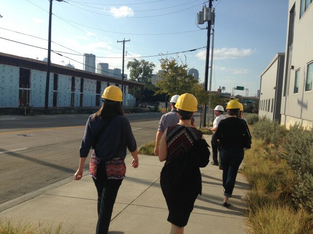
Living out this need for context, NNIP scheduled tours in Dallas. I had the opportunity to visit the Cottages at Hickory Crossing, the city’s first Housing First community. The 50 approximately 400 square foot single occupancy homes are for the homeless, mentally ill, and previously incarcerated. Future residents of the Cottages will have access to a suite of supportive on-site health and social services.

We walked through the construction, asked questions, and learned about the evaluation plans paired with the program. Even before the residents have moved in, the Cottages are planning an evaluation of the initiative – tracking resident outcomes and savings to Dallas taxpayers, for example. Residents are those who incur the highest cost to taxpayers by remaining homeless, less healthy, and less supported.

nnip 1

By the way, the Cottages at Hickory Crossing have their own Target registry if you would like to help furnish the homes!

NNIP Partners as Local Leaders & Conveners

Several NNIP partners discussed how they lead the conversations and collaborations around data within their cities. Many hold “Data Days” – events usually involving trainings and/or collaborations around neighborhood datasets of interest. Milwaukee’s Impact Inc. is holding their first Data Days this week. Charlotte, NC held their Data Days earlier in October.

One of the most interesting examples of data leadership? Every month Cleveland’s NNIP partner, the Center on Urban Poverty and Community Development at Case Western University, convenes all of the city’s organizations that collect data so they can share their work and build up a citywide data catalogue.

To accomplish their local work, NNIP partners form strong, trusted relationships with government agencies, police departments and other public collectors of data. During the meeting, partners what it took to open up in-demand local data and information for residents. One of my favorite insights came from Data-Driven Detroit (D3) who shared concrete advice for cities working with police departments to open up data.

Going forward, I hope NNIP partners can continue to discuss how data can build and repair community relationships in our cities. In Chicago there is so much work to do in this area. Data can be open and free, but if residents don’t trust it, there is still work to be done. Our own Kyla Williams spoke to this on social media while following the NNIP meeting remotely:

Data for Local Action

NNIP isn’t just about the data for data’s sake; it’s about turning data into informed local action. At the end of the day, if the data aren’t useful, used, or noticed then they are worthless. It’s all about democratizing information for community empowerment and smart policy decisions. This theme echoed several times throughout the NNIP meeting. One example was in Impact, Inc.’s mantra: “No data without stories, no stories without data.”

During the meeting, NNIP dared its partners to make their tech ecosystem. What does that mean? It means taking inventory of information lifecycles in your city and where residents and local organizations fall in those process maps. After all, it’s not enough to know how data is collected, analyzed, and repurposed; cities also need to know how neighborhood indicators and data stories can be turned into smart policy changes and smart local programs.

Here at Smart Chicago we’re also been thinking about ecosystem definition, turning data into action, and formulating meaningful resident engagement around Chicago’s data work. Between Array of Things, WindyGrid, and last year’s Chicago School of Data, there’s a lot to talk about! There are also essential Chicago partners with excellent neighborhood data: DePaul’s Institute for Housing Studies, the Woodstock Institute, and the Heartland Alliance. We need to work together to centralize our neighborhood data, engage with residents and make sure that Chicago isn’t just a “smart city,” but a smart city that works for everyone.

NNIP as a Community of Learning

The NNIP meetings are called “meetings” and not conferences for a reason. There was a palpable roll-up-your-sleeves attitude across the participating partners. I heard stories of people traveling to friends and collaborators in other cities to help replicate successful work nationally. Again, this is a great group of humans.

Those of us visiting NNIP or attending for the first time certainly saw the value of these meetings. Collecting, using, and disseminating neighborhood data to improve your city can be slow work with long-term gains. Having a supportive national network facilitating peer learning seems like an essential ingredient to progress.

Well said, April! Let the homework begin!

To see all NNIP documentation on the Dallas 2015 meeting, see their website.