CUTGroup #11 – Expunge.io

Smart Chicago conducted our eleventh Civic User Testing Group (CUTGroup) test as part of our current work around this grant from the Knight Foundation given to Chris Rudd and Mikva Challenge to “update Expunge.io with new design and new features that will make the web-app more appealing and effective for its users.”

screenshot-expunge.io

Here are the questions we wanted to answer through this test:

  • Is Expunge.io easy to use? Do users like the website? Are there any problems/issues using the website?
  • What stands out on Expunge.io? What do users remember? Do users have a good understanding of the expungement process after visiting the website?
  • Do they want to share information with others?
  • How can Expunge.io be improved?

Segmenting

Instead of doing our normal callout to our CUTGroup participants, Mikva Challenge invited their youth to do a test on Thursday, August 28, 2014 from 4:30 – 5:30 PM. We had 7 testers show up to the Mikva Challenge Office at 332 S. Michigan Ave in the Loop. We figured that some of these youth might already know a lot about the Expunge.io website, but we still got great responses and suggestions for improvements.

We invited all of these youth to join the CUTGroup, it was optional for this test, but everyone signed up. Here is a look at what neighborhoods they live in:

View CUTGroup 11: Expunge.io in a full screen map

 Test Format

We did a focus group-style test with two 30-45 minute sessions.  One group had 5 testers, and the second group had 2 testers. Testers were asked to respond to the questions on their own, but proctors were at each session to ask questions and get more information and details.

Testers used this form to drive through the test and answer questions. We asked questions about internet and device use, knowledge of the juvenile expungement process, and website review.

We added a new task to the test to gauge whether something stood out to testers after viewing the homepage. After testers reviewed the homepage for the few moments to answer a previous questions, we asked them to turn off their laptop screens and draw what they remembered. Here is a look at their drawings:

Results

We learned that testers like Expunge.io because it is a simple, easy to understand website that clarifies the juvenile expungement process.  It’s not about the technology, but instead about sharing and getting information in order to get more juvenile records expunged.

Is Expunge.io easy to use? Do users like the website? Are there any problems/issues using the website?

The majority of testers thought that Expunge.io was really easy to use. The language on the website was described as “plain” or “simple” and testers thought the steps made it easy to follow.

6 out of 7 testers (86%) liked the website, and the 1 tester who did not like the website was “in between.”

The biggest issue that needs to be addressed is the fact that some users cannot get through the step-by-step expungement process on the website because of access being restricted by parental controls. This happens to be the case when the links have language that includes “adult:”

  • http://www.expunge.io/adultrecord
  • http://www.expunge.io/adultorjuv

Since this website is driven by youth, it is important that youth can access the website at schools and at home and these links should changed so they will not be flagged by parental controls.

What stands out on Expunge.io? What do users remember? Do users have a good understanding of the expungement process after visiting the website?

When testers were asked to draw the homepage, 6 out of 7 testers remembered the three boxes/steps. These testers, however, were not able to recall the steps specifically or what each step is.

The two pieces of information that really stood out for testers was the fact that there was a cost associated with the expungement process and that you needed to be over 18 before your record was expunged. During the session, some testers felt like this information needed to be better represented at the beginning of the process. Even though there is a fee waiver, testers were stuck on the fact that they would have to pay for the expungement process. Some testers felt that if they are sharing this with their peers and friends, they would not want this type of information to be “hidden.”

Do they want to share information with others?

6 out of 7 testers generally share information through social media on regular basis. When asked if they would be willing to share information about Expunge.io, all testers were willing to share information to help their friends and the people they know.

When asked to draw the homepage, only one tester noticed the social media icons on the bottom of the page.

MJ (#6) thought that if you do not have a record, “There should a page where it says something like ‘Congratulations! You don’t have a record! Here’s what you can do to help others…”

By providing users a clear call to action would allow more users to help others by sharing information.

How can Expunge.io be improved?

Access Restrictions

We learned that through this test that links that have the word “adult” triggers the parental controls and restricts access to the website. Since this is a youth driven website, all links need to be changed to have youth-friendly language so youth can visit Expunge.io at any location.

More information about process

Testers wanted more information about the expungement process cost, fee waivers, and the age restrictions to be more noticeable at the beginning of the process. Most testers felt that if they are sharing this type of information with their friends, it should not be “hidden” in the website but be clear and upfront.

Polar Bear (#3) said that the website needs to “be more specific especially if one that isn’t 18 and can’t do this will want to know from the start.”

More information found in the FAQs should be added to the homepage.

Call to Action

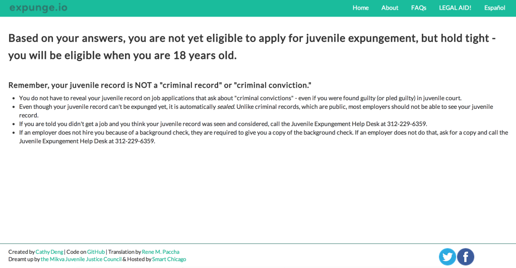
Testers were very interested in sharing this information to their friends and peers because they thought it was important to “help.” Social media should be used more often as a call to action. On this page, as an example, even if the youth is not eligible to apply for juvenile expungement, there should be a call out to share with their networks to spread information about the juvenile expungement process.

Screen Shot 2014-10-23 at 12.39.29 PM


Smart Chicago will be working with the  Mikva Challenge Juvenile Justice Council to share these results and prepare for two additional tests with youth for Expunge.io. We hope to help create a plan to make this website work for more people.

Final Report

Here is a final report of the results with notes from each CUTGroup test session, followed by each tester’s responses, and copies of other questions we asked:

The raw test data can be found below with the written answers from every tester.
 

CUTGroup #10 – Build it! Bronzeville

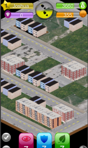
For our tenth Civic User Testing Group session, we tested the Build It! Bronzeville app, which is a mobile game app that uses GIS technology to help residents guide development in their neighborhood as they complete quests (i.e. enhance safety, visual appeal, and foot traffic). This in-person test took place at one of the Connect Chicago locations – Chicago Public Library Chicago Bee Branch at 3647 S. State Street in the Bronzeville neighborhood.

Team_Build_It_Logo

Build It! Bronzeville was a Winner of CNT’s 2013 Urban Sustainability Apps Hackathon competition, and this CUTGroup test was a part of the prize package. If you are building applications to make lives better for residents of Chicago you can sign up here for a CUTGroup test of your app. This is one way Smart Chicago supports development of innovative civic applications through developer resources.

Through this test, we were interested in finding answers to these questions:

  • How do users play games? How frequently?
  • How would users feel about registering ?
  • How do people want to contribute in the game (check-ins/receipts)?
  • Do users see a community impact from this game now?
  • Are they having fun?

Segmenting

On June 20, we sent out an e-mail to all of our 764 CUTGroup participants. We asked them if they would be willing to test a neighborhood game app on June 25, 2014. We asked some screening questions to gather information, and chose our group of participants based on a diverse selection of answers. The app was available only to Android users, and we segmented testers by Android phone and tablet users. We wanted to focus on getting testers in the Bronzeville or South Loop areas, but were open to other neighborhoods.

We confirmed 14 testers but only 6 testers ended up coming to this test. There was not a clear reason for why testers did not show up for this test. The furthest a tester traveled from their home location was 11.02 miles.

Here is a look at which neighborhoods our testers came from:

View CUTGroup 10: Build it! Bronzeville in a full screen map

Test Format

This was an alpha-test of the app which focused on three levels of a game. We wanted to see if testers understood the game, if they liked the design and playing, and if they like the element of sharing receipt data to get in-game benefits.

For this test,  it was important that Smart Chicago and part of the Team Build it! proctored the testers one-on-one to monitor tester’s actions and take notes on commentary and bugs. We advised the developer and team not to tell testers that they helped develop the app in order to receive unbiased advice from our testers.

Results

This CUTGroup test was the first time Smart Chicago tested an app in the early stages of development, and it was also the first time we tested a game app. We were excited to learn about how testers play games and what aspects they enjoyed the most. We were also very interested to learn how the community connection of this game affects if users are more inclined to play.

All of our testers brought Android phones to the test, and 5 out of the 6 testers were able to test the Build it! Bronzeville app.

How do users play games? How frequently?

We learned that the majority of testers play games on a daily basis, and normally play while they are commuting. On average, testers had 3 game apps on their mobile devices. Two testers mentioned they like to play puzzle games, while other games that were mentioned include: Threes, Piano Tiles, Farmers vs. Zombies, Candy Crush, Angry Birds.

Only 1 tester mentioned that they do not play any games on their mobile device due to a lack of time.

When we asked testers if they liked to connect to social media, 3 testers (50%) said they connect with social media on mobile games, while the other 3 testers (50%) chose not to. Privacy was a main reason to not connect with social media, since testers do not want the app to post about game play on those outlets.

3 out of 6 testers (50%) mentioned that they stop playing a game when there is nothing new or challenging in the game.

How do users feel about registering?

Two testers had problems connecting to the game on their app – MBA Girl (#4) was using a Samsung S4, while Spoung45 (#5) was using a Samsung Note 3. Spoung45 used the developer’s device to complete the test.

All of the testers (5) who were able to complete the test thought that signing up on the app was easy. There were three recommendations from testers to make signing up easier or better:

  • Text should be bigger
  • Password should be seen as she types and change to symbols
  • It would look better to be embedded in the screen rather than being a pop-up

After registering, two testers had an issue with their keyboard remaining stuck on the screen and having to close the app and restart.

How do users want to contribute in the game (check-ins/receipts)? Is there any hesitation with privacy when users are asked to share receipts?

Testers prefer to contribute to the game by checking in at local businesses versus taking photos of the receipts.

3 out of 5 testers (60%) said they would share receipts by taking photos. 1 testers who did not want to share receipts thought this was a “weird” option, while another tester did not think this benefit was fair due to individual habits and if youth want to play they might have receipts to share.

All of the testers said they normally keep their receipts on them.

4 out of 5 testers (80%) would check-in at local businesses to get in-game benefits. Both testers who would not share receipts were willing to check-in at local businesses. 1 tester who did not want to contribute by checking in said it was because she normally plays games in transit.

Do users see a community impact from this game? Do users enjoy this element? Is community involvement important to their game play?

The majority of testers liked the community improvement element of the game, but 2 testers wanted more context about why the game is set in Bronzeville and an understanding if the game levels match real, existing Bronzeville blocks.

“I always wanted to see how neighborhoods interact with each other and how money might be taken from one neighborhood to another.” – Music Lover (#1)

When Telephober (#6) saw the description for sharing receipts, she thought that sharing receipts would be “totally worth it” since it “helps the community.”

Nathalie (#2), wanted not only to contribute to what gets built in a neighborhood but also hear feedback from residents:

“The levels were sort of limiting… there’s not really a feedback loop from citizens… I would like to know if residents are happy with two salons on the same block.”

3 out of 5 testers (60%) said they would be more inclined to play the game if players are rewarded by spending at local businesses. Casual Gamer (#3) really disliked the receipt part of this game, and thought that the developers should “get rid of the creepy receipt scanning issues.” Casual gamer is interested in a story behind the levels and making money in the game versus to helping the community.

When testers were asked what they decided to build, 3 out of 5 testers (60%) built building based on community needs.

By adding more context to each level about the neighborhood in connection with other neighborhoods through Chicago, and an understanding of real lot vacancies in the neighborhood would provide users a well-rounded understanding of each level and the purpose of the game in general.

Are users having fun?

4 out of 5 testers (80%) thought the levels were fun, and were reminded of other games such as Cityville and Roller Coaster Tycoon. Testers preferred more realistic graphics seen in level 2 over the very basic and simple graphics in level 1. Here is a look at the graphics in level 2:

lvl2Graphics

Music Lover (#1) describes this game as “Edutainment – Educating and entertaining at the same time.” She likes that this game could prompt someone to think about their neighborhood and about what it does and does not have.

Next Steps

View and graphics

Testers preferred the more realistic graphics seen in level 2 over the basic/simple graphics of level 1. During the levels, most testers had difficulties tapping the lots, and clear boundaries of lots should be added.  Most testers were also unaware that they could move around on the map, and wanted to zoom out to see the full block.

Bug fixes

Since this was an early test of the game, there were a number of bugs that testers faced, specifically:

  • Samsung S4 and Samsung Note 3 both could not load the app
  • Keyboard stayed open after signing up and could not be removed without backing out of game entirely
  • Lots would not “pop” when tapped
  • When taking a photo of a receipt, screen remained stuck on “sending data” action

More information

Overall, testers enjoyed playing Build it! Bronzeville, but wanted more background information about the game. Providing context about why this game is in Bronzeville and the spending at neighborhood businesses in the tutorial would give users a firmer understanding about the purpose of the game.

In order to make the game easier to use, more tutorials or descriptions of icons and features should be added:

  • All icons should be described including the money and people status bars
  • Better information about how money is generated
  • More information about the building types
  • A story or information about overall goal of game
  • Information in relation to whether or not these are blocks in Bronzeville
  • Tutorial for gem store once money runs out

Build it! Bronzeville is an opportunity for users to think about what their neighborhood lacks, and offer suggestions on how to make their neighborhood better. By providing a story and information about the type of information gathered, will build a strong community element for users.

Final Report

Here is a final report of the results with notes from each CUTGroup test session, followed by each tester’s responses, and copies of our e-mail campaigns and the questions we asked:


The raw test data can be found below with the written answers from every tester.
 

Foodborne Chicago, Humans, and Big Data on the Data Mine Blog

Foodborne Chicago, Humans, and Big Data on the Data Mine Blog

Here’s a post on the U.S. News & World Report Data Mine blog covering our Foodborne Chicago project: How Twitter and Your Lunch Can Solve Problems. Here’s a snip:

Daniel O’Neil, the executive director of Smart Chicago, who worked with the government on the algorithm, said the project is an example of how big data can be used by health professionals to help people.

“I think the field of big data often removes human beings from consideration,” he says. “Big data, as I see it being practiced, there’s very little direct engagement with people. All the data related to health care is generated from human beings and is crucial to the health and wellness of human beings. I think this project shows one way for big data to always be driven down to the human being and helping people. We need to always take it from big to small and always find out how technology can be of big use to people.”

Open Street Mappers! Help support the efforts to fight Ebola in West Africa

Since March, the Humanitarian OpenStreetMap Team (HOT) has been supporting the work of Doctors Without Borders by mapping out areas that have been affected by the Ebola outbreak.

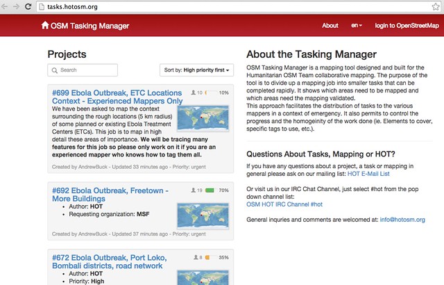
osmtaskmanager


During a disaster, the Humanitarian OpenSteetMap Team (HOT) activates to help coordinate mapping of disaster areas. These activities include mapping out roads, buildings, locations of refugee camps, and other resources. In addition, they also maintain a wiki with information about the disaster. To get an idea of what this looks like, here’s what the OSM community did after the earthquake in Haiti.

OpenStreetMap – Project Haiti from ItoWorld on Vimeo.

Currently, the Humanitarian OpenStreetMap team is reposonding to several requests from Doctors Without Borders to help map areas affected by the Ebola outbreak. If you’re a beginner with OpenStreetMap, they’re asking for people to map out the roads using Bing imagery. More experienced mappers are being asked to trace out features near Ebola Treatments Centers in West Africa.

If you have an OpenStreetMap account, you can log into the OSM Tasking Manager and select tasks.

If you don’t have an OpenStreetMap account, you can sign up for an account for free here. OpenStreetMap is easy to use and there are several tutorials available, including this one by Chicago’s very own Ian Dees.

If you have time available, please consider spending some time assisting OSM in the effort. For questions directly relating to the HOT Team at OSM, you can email them at [email protected].

Tweet your @CivicTechJobs