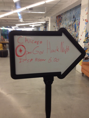
Matthew Shaxted dropped by Chicago’s OpenGov Hack Night to talk about how data visualizations can be used to create smarter cities.
Shaxted started his talk with the ways that data visualizations can help make cities more effective and efficient.

Matthew Shaxted dropped by Chicago’s OpenGov Hack Night to talk about how data visualizations can be used to create smarter cities.
Shaxted started his talk with the ways that data visualizations can help make cities more effective and efficient.
Live stream of tonight’s OpenGov Hack Night.
Note: Google Plus recently launched a Q&A app for hangouts. We’ll be trying this out tonight.
Chicago Works For You (CWFY) is comprised of three components: a AngularJS/Jekyll front-end, a custom Go API and worker layer, and a PostgreSQL/PostGIS database. This post will dive into the mechanics of the system and explain why it works the way it does.
CWFY started with only a handful of requirements. It had to pull service requests from Chicago’s Open311 API, save them to a database, do some math, and expose the results to a pretty user interface.

The first sketch of the system was pretty rudimentary, but it matches very closely the end result. We implemented the worker and API in Go, a powerful and fun language that is well-suited for this type of work. We are hosting the Go applications and database on a m1.medium EC2 instance on the Smart Chicago Apps infrastructure.
The worker application finds the timestamp of the most recently updated service request in the CWFY database and asks the Open311 API endpoint for all service requests created or updated since that point. This repeats every thirty seconds. That interval is short enough that we’re not clobbering the Open311 API, the number of requests in the response is small (usually less than a dozen), and we still have near-real-time data on our site. We’ve found that the Open311 API is very reliable — and fast — and can stand sustained load, as it did when we backfilled our database.
The database schema is very simple. There is a single service_requests table with more than three million rows. That’s all service data stretching back to January 2008. This table is very similar to the service_requests schema used by Code for America’s 311.fm application. In fact, we used that schema to bootstrap this application.
There are two tables of ward boundary data, one for the current ward boundaries, and one for the new ward boundaries, to be instated in 2015. But the city’s service request records only include the ward the request iscurrently in. Using the popular PostGIS PostgreSQL extension, we’re able to use the latitude and longitude associated with each service request to geo-locate it within its 2015 ward-to-be and determine if it’s in one the 233 areas of the city that are changing from one ward to another. These calculations allow CWFY to compute service delivery information for current and future wards, as well as individual transition areas.
Finally, there’s a daily_counts table, populated with counts of service requests opened for each day, ward, and service type combination. This table is populated automatically by a Postgres trigger, and allows CWFY to perform quick aggregate calculations.
The API layer is a collection of HTTP endpoints that generate JSON. Instead of building an API and then building a client, we built the API to explicitly support the needs of the user interface. We would sketch out ideas for how we’d like to present the data, then work backwards from that to determine what endpoints were needed, what data they must expose, and how to format that data. Each endpoint allows for JSONP output, making use by JavaScript applications very simple. The API sits behind a Varnish cache server, significantly reducing the load on the database during periods of high traffic.
The user-facing application is powered by HTML and AngularJS. We use the Jekyll static site tool to automatically generate pages for each ward and service type, and to manage packaging the SCSS and Javascript assets. AngularJS is a powerful framework for building API-backed JavaScript applications. Angular manages all of the communication between the front-end and the API.
The site is hosted in a Amazon Web Service S3 bucket, making it very inexpensive to host, highly available, and simple to update.
We relied heavily on third-party libraries to speed our development. We acknowledge the following and offer our thanks:
Today we’re launching a new project, Chicago Works For You, a citywide dashboard with ward-by-ward views of service delivery in Chicago.
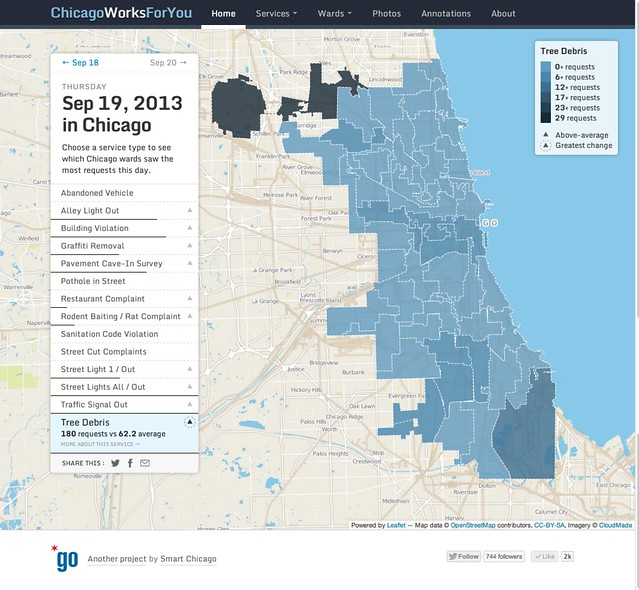 This site is going to be a central tool for Smart Chicago as we continue our work around internet access, digital skills, and civic apps. It allows us to engage residents, government, and developers around shared data so that we can all work together to make Chicago work better for all.
We’re conducting CUTGroup tests with residents, offering training and outreach to Alderman, and maintaining a full API of the data that drives our site.
This site is a result of years of work by many. It would not be possible without the vision of the MacArthur Foundation and the Chicago Community Trust to fund the Open311 project and the determination of the City of Chicago to make that implementation the largest and most comprehensive one in the world.
Much more to come. Write me at [email protected] with questions or comments.
Meanwhile, here’s a look at what this site does, taken from the About page:
The homepage is a citywide map with a daily summary of all service requests submitted, by service type and ward.
Dark lines under and up-arrows next to a request type means there were more requests of that type on that date than average. The longer the line, the higher above average. Highest above average is highlighted on the map as default.
Click any service request type to see the raw numbers and averages. The legend in the lake shows you the number ranges for each type in each ward. Click any service type to see those numbers for any day.
Go back and forth in time, it will show numbers for that service request, updating the web address so that you can share any view via Twitter, Facebook, or email.
For advanced users who like to hack URLs, you can type in any date you want, going back to January 1, 2008, the first day for which we have data from the City.
Choose any service request type from the Services menu to see weekly views of service delivery by ward.
The bars show all requests opened in each ward, displayed by the day of the week it was opened. Hover over any bar to see exact numbers of opened requests. The check mark is how many requests of that type were closed in each ward.
Click any day to see that service type on a map.
Move backward and forward in time to see the weeks go by.
Each service has details on the work it takes to close requests. Again, you can share any view and click links to view raw data or submit requests of this type.
Choose any ward to see the week in review– all open and closed requests. You can choose any request or view all of them at the same time.
The Time-to-close ranking shows the average time from open to close, per request, in context with all other wards.
The Days with the most requests is a raw count for each service type for this ward, going back to January 1, 2008.
The alderman name links to their ward website, and the Chicago start links to their contact information on the City website. See also Facebook account, Twitter stream, and legislative history (as compiled by Councilmatic) links.
See the last 500 photos submits with service requests. You can sort by service request and see raw counts. Clicking any image takes you to the detail page on the City’s Service Tracker website to see details and current status.
All of the data, maps, and charts on this site are just mute representations of a 14-type portion of the services delivered by the city for the city. We use our Tumblr blog to make observations and solicit yours.
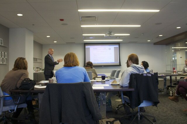 The Smart Health Center project places trained health information specialists in low-income clinics to assist patients in connecting to their own medical records and to find information about their health online. The project is a joint effort led by the Alliance of Chicago in collaboration with the Otho S. A. Sprague Memorial Institute and the Smart Chicago Collaborative. We’d like to share a few updates about how the program is doing.
 Here at Smart Chicago, we regularly work with units of government on a wide range of matters. We collaborate with City Departments on websites that increase collaboration with residents, with the Mayor’s Office on policy and implementation of technology efforts, and with the State of Illinois on expanding the open data movement.
In the context of this work, and in my role as co-chair of the New Media Council for Cook County Board President Toni Preckwinkle, I see first-hand the immense opportunity that we have in this region to improve lives through technology and data.
But I also see that there is a lack of supply for the jobs inside government that are essential for this work to continue.
For instance, here’s a great job at Cook County, working directly for CIO Lydia Murray in the Office of the President. Lots of people ask me in my work about ways they can get involved in the fecund civic innovation here in the Chicago region. Here’s one, right here.
DIRECTOR OF TECHNOLOGY COMMUNICATIONS
Requisition ID: 00114960
Job Posting: Sep 12, 2013, 9:12:00 AM Closing Date: Sep 26, 2013, 11:59:00 PM
Full-time Shift Start Time: 8:30 A.M. Shift End Time: 4:30 P.M.
Posting Salary: $90,000-$105,000
Organization: Offices Under the President